Best Color Schemes for Streaming Rooms, Podcast Studios, and Content Creation Spaces
A streaming room, podcast studio, or content creation space needs to do more than look good in person. The colors, finishes, lighting, furniture, and decor all become part of what viewers see on camera.
A great studio design should create separation between you and the background, give you control over lighting, reduce distracting reflections, and still feel comfortable when the cameras are off.
For most content creation spaces, the best approach is to keep permanent surfaces relatively neutral or subdued and use lighting, furniture, artwork, acoustic treatments, and decor to introduce stronger colors.
These Streaming Room and Podcast Studio Color Ideas cover paint colors, lighting, decor, acoustic treatments, flooring, and other elements that help create a camera-ready space. If your studio is also used as a home office, you may also want to read our guide to the best paint colors for home offices.
Table of Contents
- Designing a Content Creation Space Around the Camera
- Dark vs. Light Content Creation Rooms
- Best Color Schemes for Content Creation Rooms
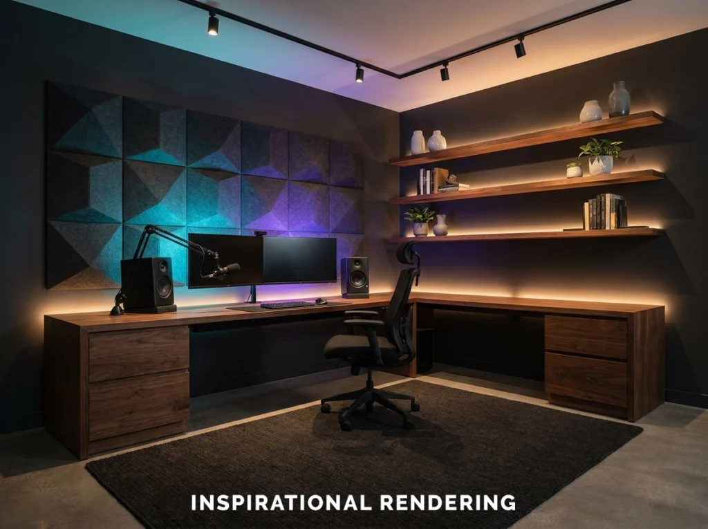
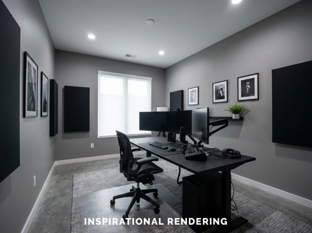
- Charcoal, Warm Wood, and RGB Lighting
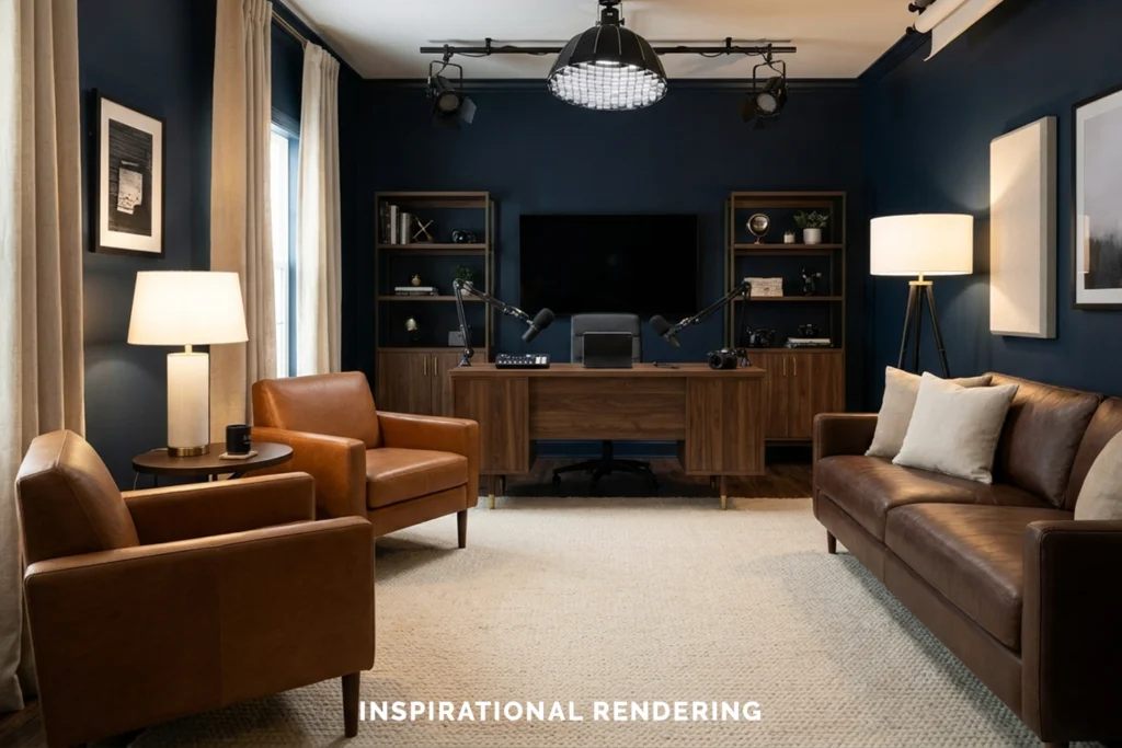
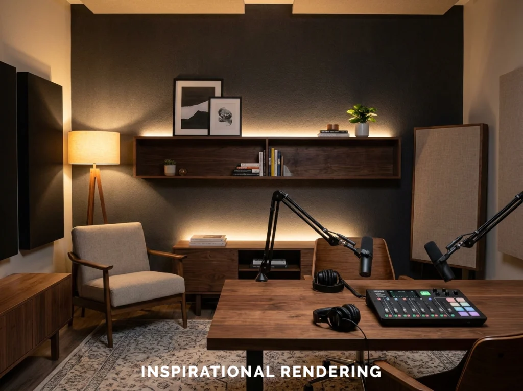
- Deep Navy, Walnut, and Warm White
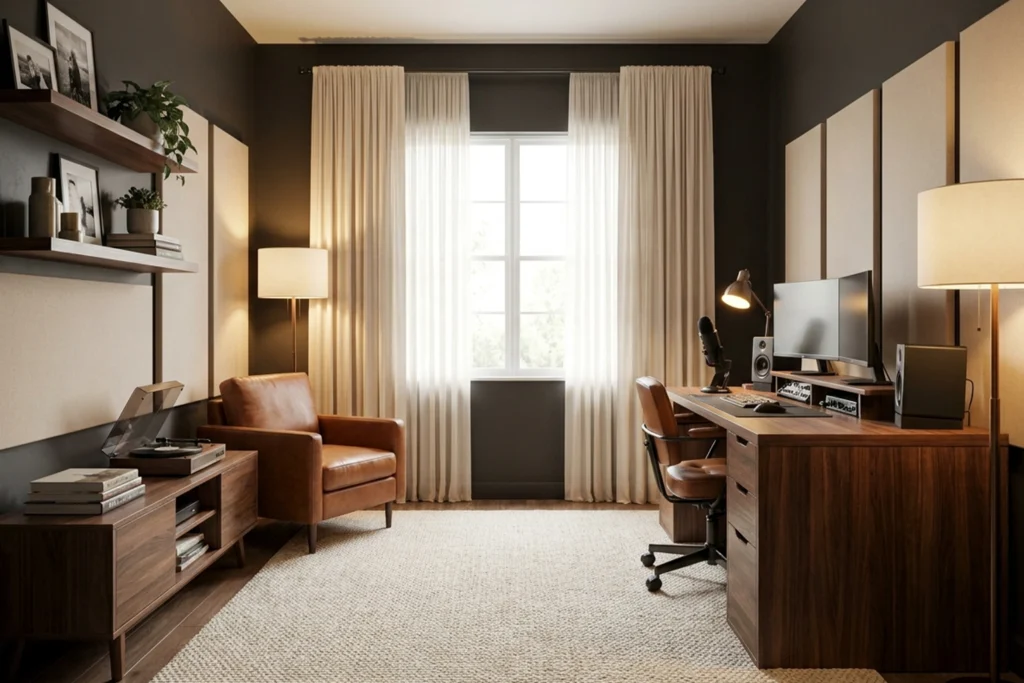
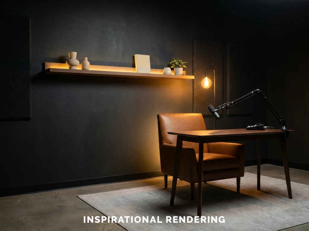
- Warm Charcoal, Cognac, and Cream
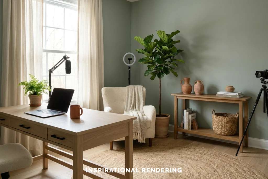
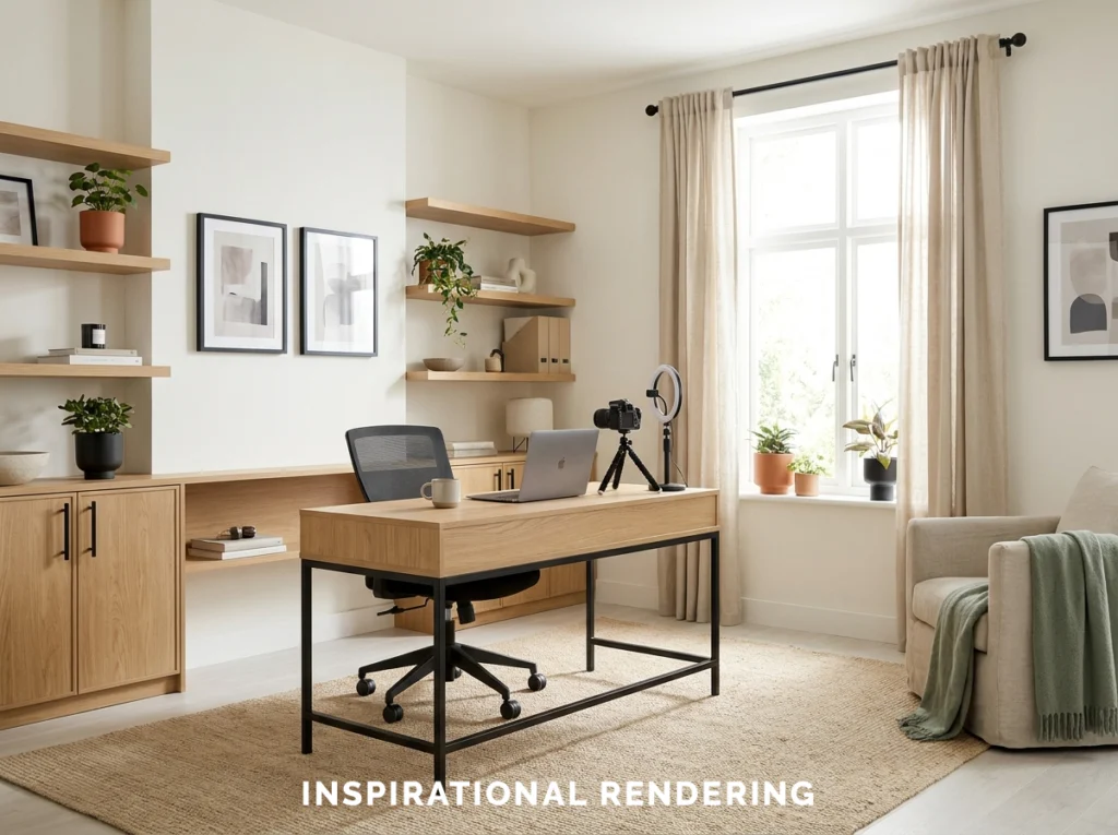
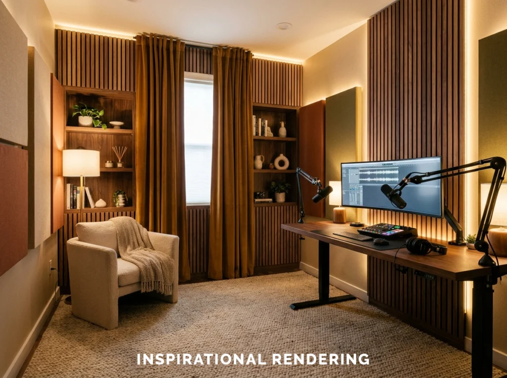
- Muted Sage, Oak, and Cream
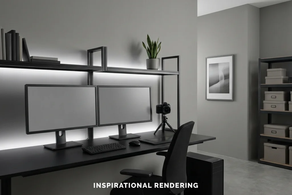
- Neutral Gray, Black, and White
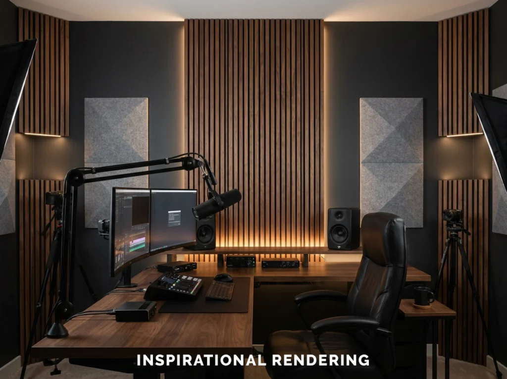
- Black, Wood, and Amber Lighting
- Off-White, Light Oak, and Black
- Choosing the Right Paint Finish
- Coordinate Paint Colors With Studio Lighting
- Create Depth Behind the Camera
- Coordinate Acoustic Treatment With Your Design
- Choose Flooring With Sound and Lighting in Mind
- Decorating a Streaming or Podcast Background
- Color Schemes for Video and Photo Editing Rooms
- Designing Around a Green Screen
- How to Choose the Right Studio Color Scheme
- Professional Interior Painting in Northern Colorado
- Frequently Asked Questions
Need Help Choosing paint Colors ?
Qualifying MGM Painting Co. projects include a free professional color consultation through our partnership with Guiry’s Color Source. Our customers can meet one-on-one with a professional designer who can help compare wall colors and coordinate paint with lighting, flooring, furniture, acoustic treatments, and other features in a streaming room, podcast studio, or content creation space.
This can make choosing a studio color scheme much easier, especially when you need the room to look good in person, under artificial lighting, and on camera.
Designing a Content Creation Space Around the Camera
Before choosing paint colors, decide where your camera will normally be positioned. Stand where the camera will be positioned and look at the room from that perspective.
- Which wall will form the primary background?
- How much of the ceiling will appear in wider shots?
- Will shelves, acoustic panels, artwork, or furniture appear behind you?
- Where will your key light and background lights be positioned?
- Will natural light enter through a window?
- Do you want the room to feel bright and natural or dark and cinematic?
- Will the space also function as an office, bedroom, living room, or guest room?
Dark vs. Light Content Creation Rooms
Both dark and light color schemes can work well for content creation. They simply produce different results.Dark Studios
Charcoal, black, navy, and other deep colors give you greater control over the visual environment.
- Gaming streams
- Technology channels
- Automotive content
- Music studios
- Cinematic interviews
- Podcast studios
- RGB lighting setups
The tradeoff is that dark rooms need intentional lighting. Without enough light or contrast, a black desk, black chair, dark clothing, and charcoal wall can visually blend together.
Light Studios
Cream, off-white, light greige, sage, and other lighter colors create a more open and natural appearance.
- Beauty content
- Cooking videos
- Craft and DIY content
- Educational videos
- Lifestyle creators
- Product demonstrations
- Home offices used for video calls
For more information about how windows and daylight affect wall colors, see our guide to choosing interior paint colors around natural light.
Best Color Schemes for Content Creation Rooms
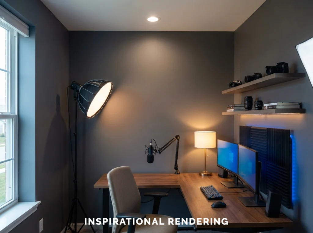
There is no single color palette that works for every creator. Your ideal combination depends on what you create, how you light your videos, your furniture, your branding, and whether the room has other uses. These are some of the most versatile combinations.Charcoal, Wood, and RGB Lighting
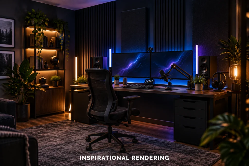
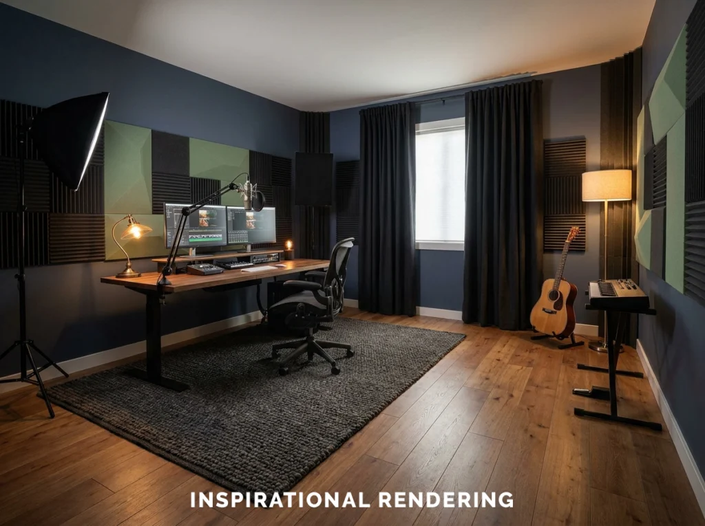
Instead of permanently committing the room to blue, purple, or another saturated color, charcoal gives you a neutral surface that can change appearance depending on your lighting.
To create this combination use:
- Walnut or medium-tone wood
- Matte black furniture
- Dark gray acoustic panels
- Simple floating shelves
- Cyan, purple, blue, or amber accent lighting
Navy, Walnut, and Warm White
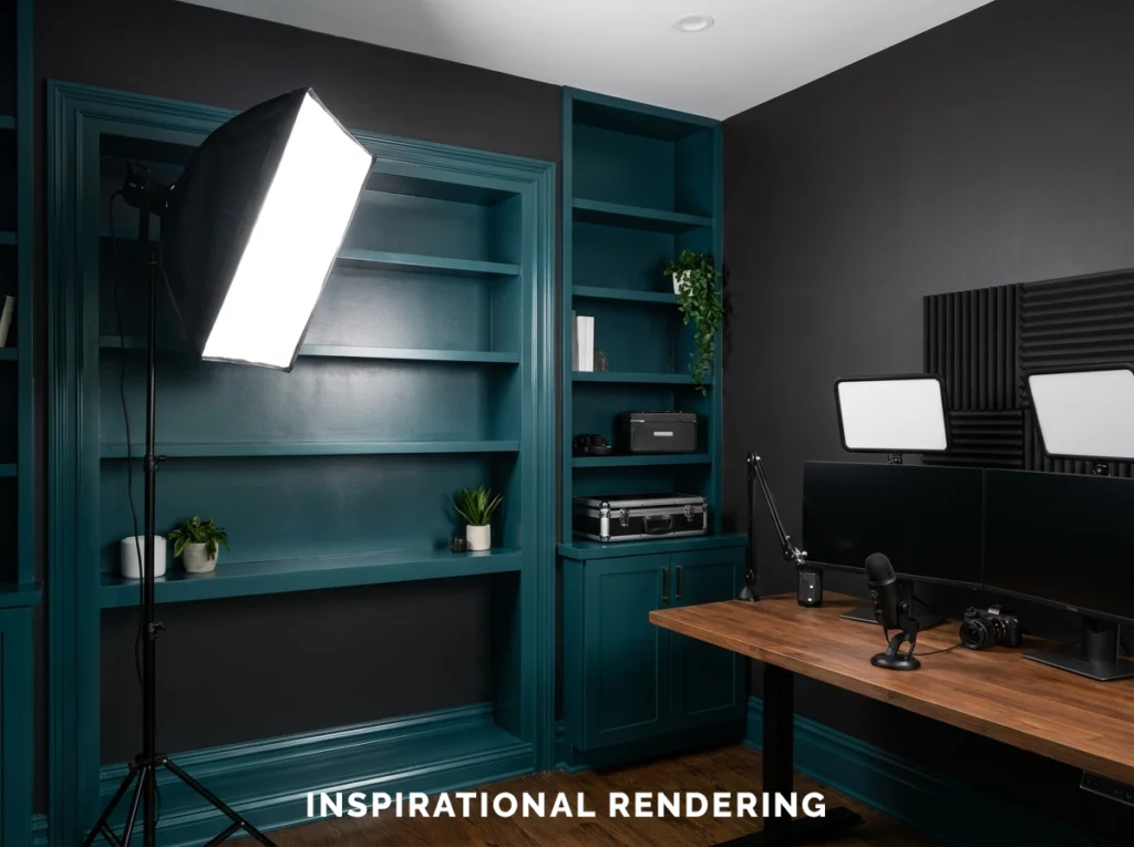
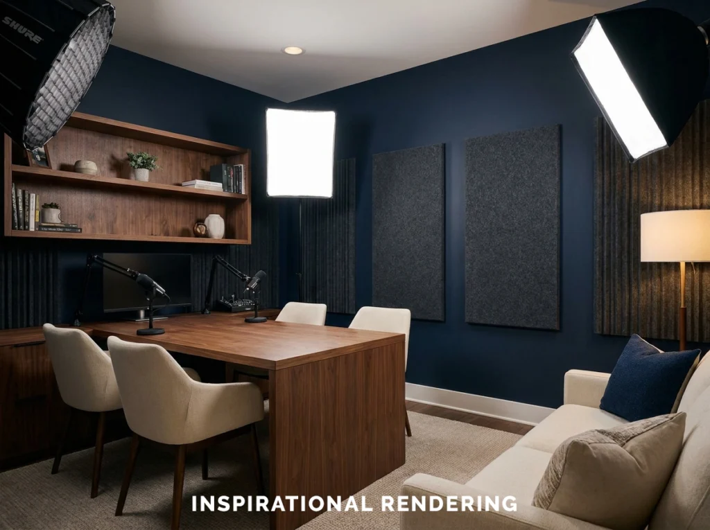
Deep navy is one of our favorite choices for podcast studios and professional content creation spaces. It adds more color than charcoal without becoming overly bright on camera.
To create this combination use:
- Walnut desks and shelving
- Cognac or brown leather
- Warm white lamps
- Black microphones and equipment
- Brass or dark metal accents
- Cream or beige textiles
Charcoal, Cognac, and Cream
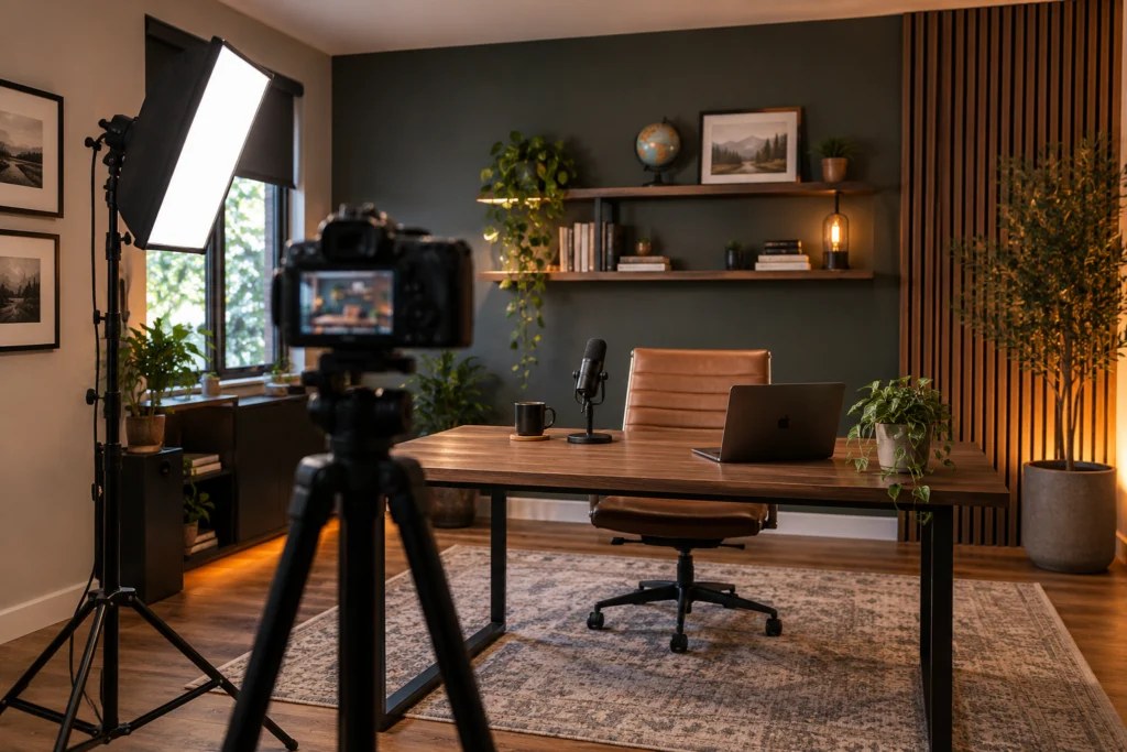
For a professional studio that should still feel residential, try warm charcoal with brown leather, warm wood, and cream.
This combination works especially well when a podcast room doubles as an office or sitting room.
To create this combination use:
- Warm charcoal walls
- Cognac leather chairs
- Walnut shelves
- Cream curtains
- Soft beige or oatmeal acoustic panels
- Warm lamps
- Muted green plants
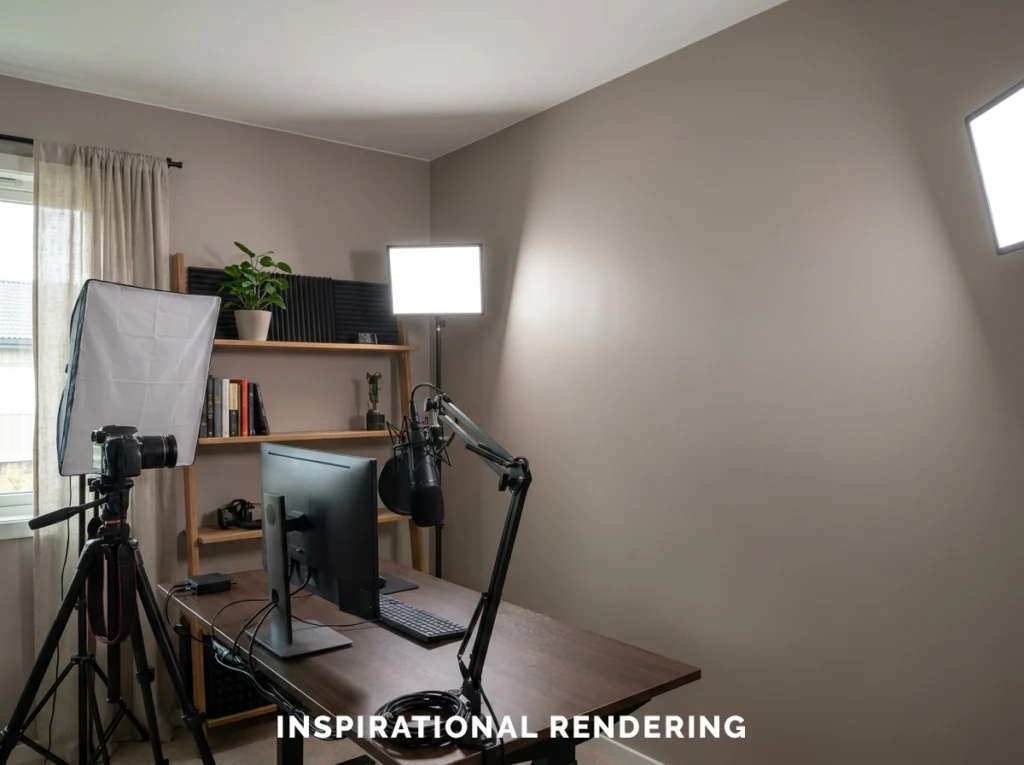
Muted Sage, Oak, and Cream
Not every content creation room needs to look like a traditional recording studio.
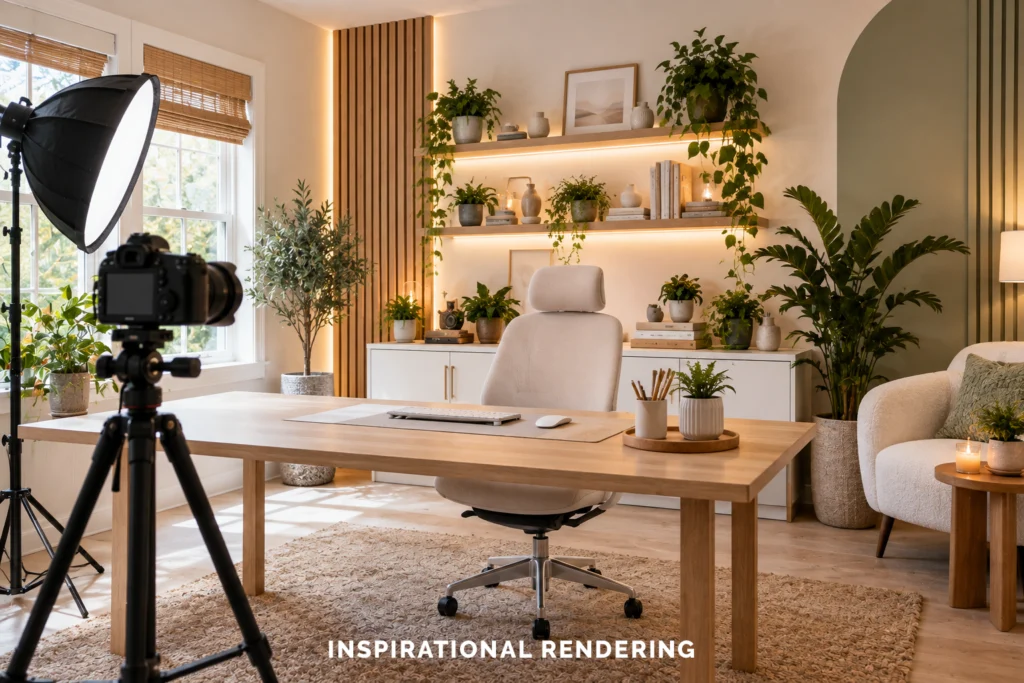
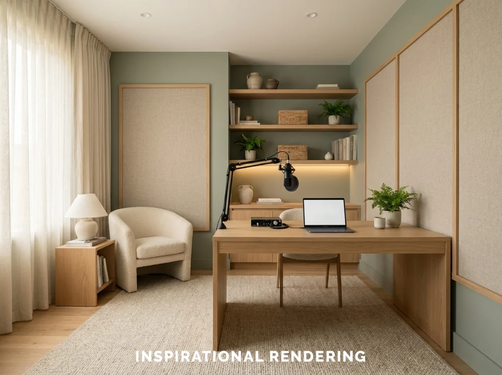
Muted greens can create a softer background that works especially well for lifestyle, wellness, educational, beauty, food, and home-related content.
To create this combination use:
- White oak
- Cream upholstery
- Linen curtains
- Black hardware
- Natural fiber rugs
- Terracotta or clay accents
- Plants
Neutral Gray, Black, and White
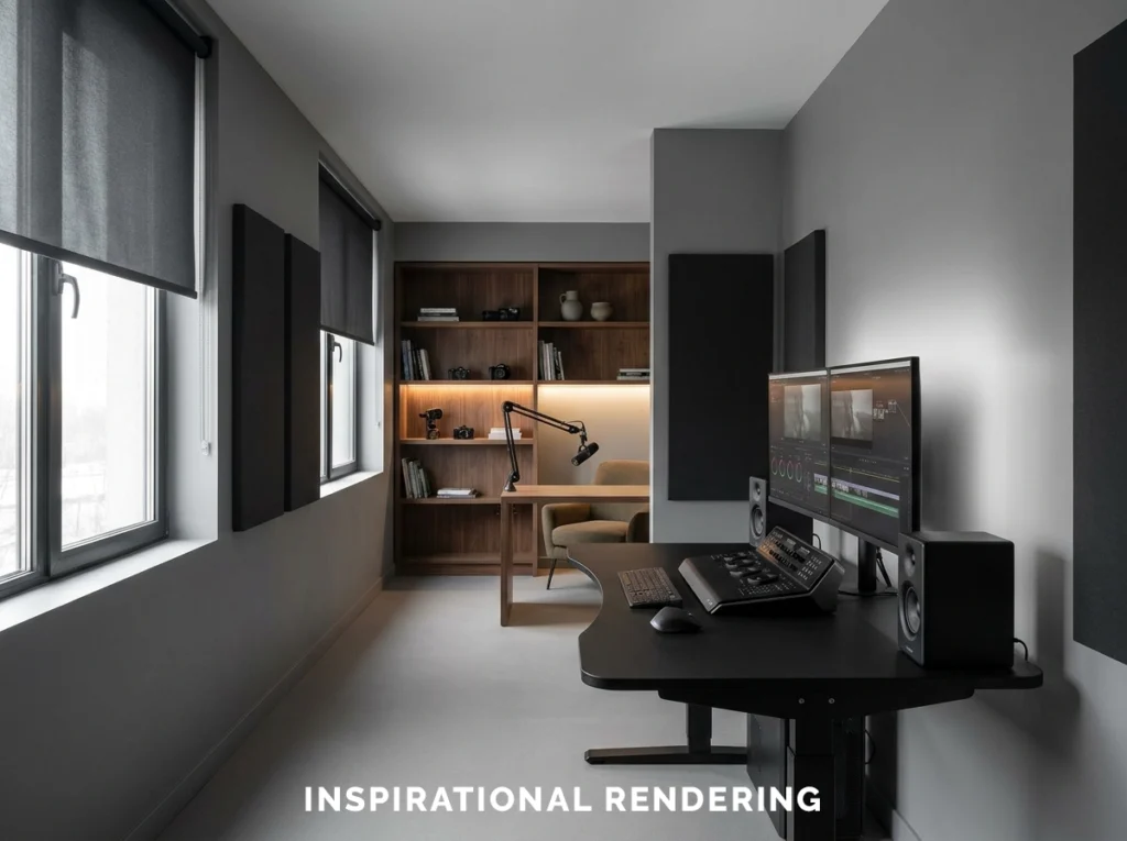
Neutral gray is particularly useful for rooms where accurate color matters. Photographers, video editors, designers, and other creators often benefit from limiting strong surrounding colors near their monitors.
To create this combination use:
- Neutral gray walls
- Black desk
- Dark monitor surrounds
- Minimal colored decor near the workstation
- Controlled neutral lighting
Black, Wood, and Amber Lighting
Black walls can create an impressive podcast or video studio when the room has enough lighting and texture.
To create this combination use:
- Walnut acoustic slats
- Warm wood furniture
- Brown leather
- Amber lighting
- Dark green plants
- Gray acoustic panels
Off-White, Light Oak, and Black
For bright content, an off-white room can be an excellent choice.
It is particularly effective for beauty, cooking, family, craft, product, fashion, and educational content.
To create this combination use:
- Light oak furniture
- Black hardware
- Beige or linen textiles
- Muted artwork
- Simple plants
- One controlled accent color
Choosing the Right Paint Finish for a Streaming or Podcast Studio
Color is only part of the decision. Paint sheen can make a major difference when you begin pointing studio lights toward the walls. A glossy surface is more likely to create visible reflections and hotspots. For that reason, we generally recommend keeping the primary camera-facing walls relatively low in sheen.
Matte
Matte is an excellent option for feature walls and camera backgrounds. It produces very little reflection and gives dark colors a rich appearance.
Satin
Satin can work well on doors, trim, cabinets, and other surfaces that need additional durability. However, be aware of where studio lights are positioned because satin surfaces can create more noticeable reflections.
Eggshell
Eggshell is a practical choice for many residential creator rooms. It provides a low sheen while offering more durability and cleanability than a traditional flat finish.
Flat
Flat paint works particularly well on ceilings because it reduces overhead reflections and helps conceal small imperfections.
Coordinate Paint With Lighting
Never choose a studio paint color without thinking about the lighting.
A wall that looks almost black under one fixture may appear gray under another. Warm lighting can bring out brown or red undertones. Cooler lighting can make some gray and white paints appear noticeably bluer.
Before choosing your final color, consider all of the light sources in the room:
- Natural light from windows
- Key lights
- Fill lights
- Ceiling fixtures
- Desk lamps
- LED strips
- RGB fixtures
- Monitor light
Create Depth Behind the Camera
Professional-looking studios usually have depth. A person sitting directly against a blank wall can make the image feel flat, even when the paint color is attractive.
When space allows, create several visual layers:
- The subject
- Furniture behind the subject
- Shelves or artwork
- The wall
- Accent lighting
For example, you might have a charcoal wall several feet behind the desk, a walnut shelf mounted on the wall, a warm lamp on one side, and a plant or acoustic panel on the other. This gives the camera several depths, textures, and colors to capture.
Think About Contrast
You also want the person on camera to stand apart from the background. Too much of one color causes everything can begin to merge together in the final shot. Try to avoid this combination:- A black wall
- A black office chair
- A black shirt
- Minimal lighting
Coordinate Acoustic Treatment With Your Design
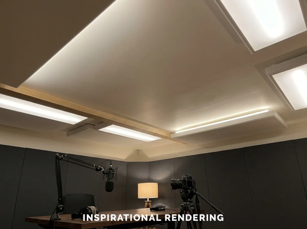
Podcast and streaming rooms frequently need some acoustic treatment. Instead of treating acoustic panels as something that needs to be hidden, make them part of the color scheme.
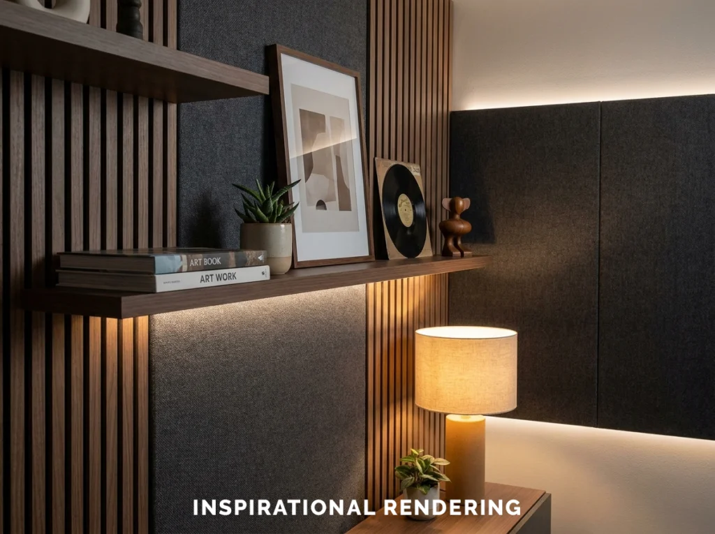
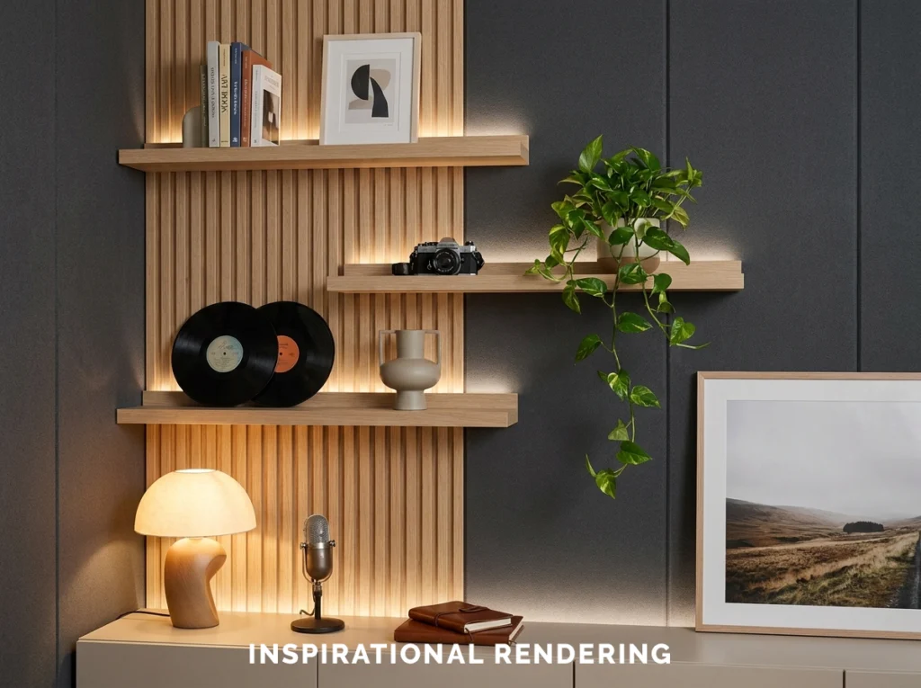
Wood slat acoustic treatments can work especially well because they introduce texture and warmth while still looking intentional on camera.
You also do not need to cover every wall in foam. Rugs, curtains, upholstered furniture, bookshelves, acoustic panels, and other soft materials can all contribute to how the room sounds.
Charcoal Studio
- Charcoal walls
- Heather gray acoustic panels
- Walnut slats
- Black equipment
Navy Studio
- Deep navy walls
- Dark gray acoustic panels
- Walnut furniture
- Cream seating
Sage Studio
- Muted green walls
- Oatmeal acoustic fabric
- White oak
- Cream furniture
Choose Flooring With Sound and Lighting in Mind
The floor can influence both the appearance and acoustics of a content creation room.
Carpet
Carpet is acoustically forgiving and absorbs a significant amount of reflected sound. It can be a good fit for dedicated studios, although some creators prefer the look of hard flooring.
Hardwood and LVP
Wood and luxury vinyl flooring look excellent with dark walls, navy, sage, charcoal, and neutral palettes. They also introduce warmth into studios containing a lot of black equipment.
Because hard flooring reflects more sound, consider adding a substantial area rug near the recording position.
Tile and Highly Reflective Surfaces
Tile, polished concrete, and other hard surfaces can increase sound reflections. Glossy flooring can also reflect studio lights into the camera frame.
Decorating a Streaming or Podcast Background
The goal is not to fill every empty surface. Instead, choose a limited number of objects that reinforce the style or subject of the content.
- Floating shelves
- Books
- Framed artwork
- Records
- Instruments
- Plants
- Collectibles
- Lamps
- Wood slat features
- Acoustic panels
Avoid Visual Clutter
Dozens of small objects can make a background distracting. Instead, combine a few larger items with negative space. A single plant, lamp, piece of artwork, and shelf often creates a more professional background than an entire wall filled with decorations.
Watch Reflective Materials
Mirrors, glossy framed artwork, glass tables, polished metal, and shiny cabinets can reflect studio fixtures. Always look through the camera before finalizing the placement of reflective decor. A reflection that is barely noticeable while standing in the room can become obvious once a powerful key light is turned on
Color Schemes for Video and Photo Editing Rooms
If the room is primarily used for editing photography or video, the design priorities change slightly. Strong wall colors near your workstation can influence how you perceive the image on your monitor.
For color-sensitive work, consider:
- Neutral gray walls
- Black or dark furniture
- Minimal saturated decor immediately around the monitor
- Controlled window light
- Neutral bias lighting behind the display
That does not mean the entire studio has to be gray. You can create a more colorful podcast or filming background on the opposite side of the room while keeping the editing area visually neutral.
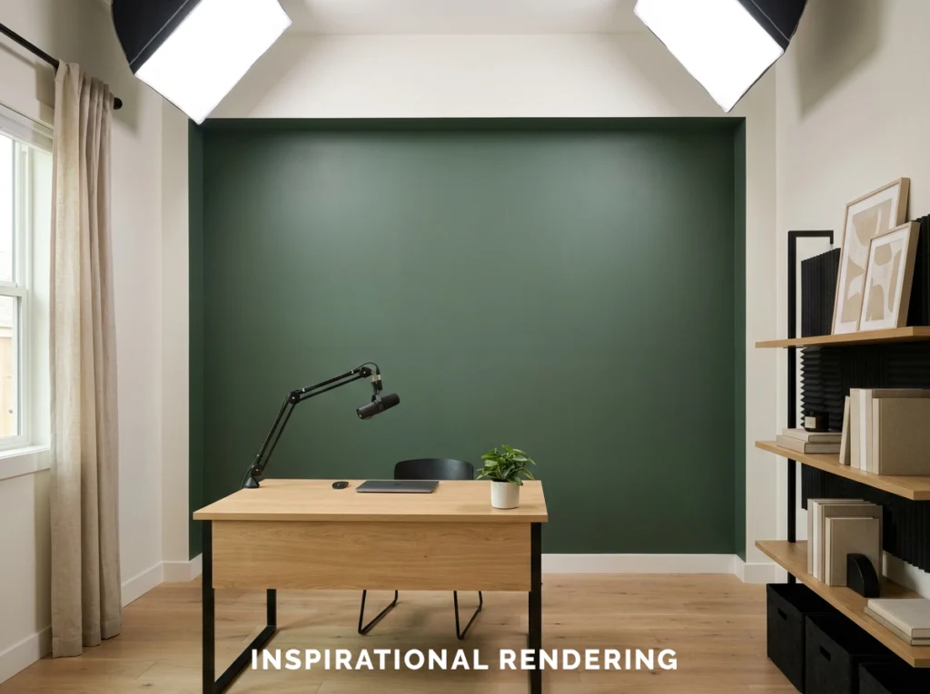
Designing Around a Green Screen
A green screen should be treated differently from a normal painted studio background.
The goal is not interior design. It is consistent color and consistent lighting.
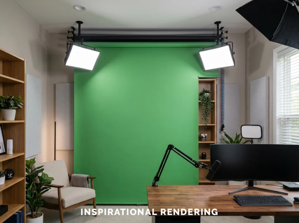
A dedicated chroma key surface should be:
- Evenly colored
- Low in sheen
- Smooth
- Evenly illuminated
- Positioned far enough behind the subject to reduce shadows and reflected green light
If you only use a green screen occasionally, we generally would not recommend designing the entire room around it.
A retractable screen or portable backdrop lets you maintain an attractive permanent studio while still having access to chroma key when needed.
How to Choose the Right Studio Color Scheme
Before you commit to a palette, answer these questions.
- What type of content will you create?
- What wall will viewers see?
- Will you use RGB lighting?
- How much natural light enters the room?
- Will the room also function as an office or living space?
- What color is your furniture?
- What colors appear in your branding?
- Do you need acoustic treatment?
- Will you be editing color-sensitive photography or video?
- Do you prefer a bright, natural look or a darker cinematic style?
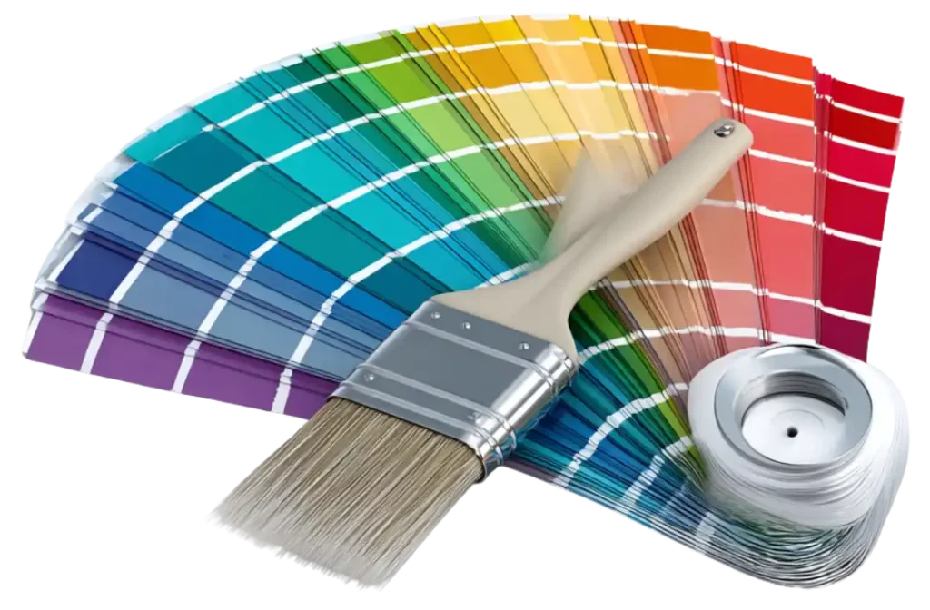
Once you have those answers, narrow the palette down to a few options and test them in the actual room. Do not rely entirely on a paint chip or computer screen. Place paint samples on the wall and look at them:
- During the day
- At night
- Under your regular room lighting
- Under your studio lights
- Through the camera you actually plan to use
The camera test is particularly important. A paint color can look excellent to your eye and noticeably different once your lighting, lens, exposure, and white balance are introduced.
Professional Interior Painting in Northern Colorado
A streaming room, podcast studio, or content creation space should have a wall color and finish that work with the lighting, furniture, acoustic treatments, and camera setup in the room.
MGM Painting Co. provides professional interior painting services for homeowners and businesses throughout Northern Colorado, including Fort Collins, Loveland, Windsor, Timnath, Greeley, Wellington, Johnstown, Longmont, Berthoud, Ault, and Laporte.
For podcast studios, offices, production facilities, and other professional environments, we also provide commercial interior painting services.
Qualifying MGM Painting Co. projects include a free professional color consultation through our partnership with Guiry’s Color Source. Our customers can meet one-on-one with a professional designer who can help compare wall colors, accent colors, trim, finishes, furniture, lighting, and other permanent features in the room.
Contact MGM Painting Co. today to schedule a free painting estimate and start planning the right color scheme for your content creation space.