Viral House Painting Trends
Social media has changed how homeowners think about paint.
A few years ago, most people picked paint colors by walking into a store, grabbing a few swatches, and hoping the color looked good once it was on the wall. Today, homeowners are seeing full room transformations on TikTok, Instagram, Pinterest, and YouTube Shorts before they ever start a project.
For homeowners in Colorado, the question is not whether a trend looks good online. The better question is whether it will work in your home, with your lighting, your finishes, your exterior materials, and your long-term plans.
Here are the viral painting trends worth knowing about in 2026, along with MGM Painting Co.’s take on which ones are worth trying.
“A color can look perfect in a video and completely different in a home with different light, flooring, trim, or exterior exposure. Trends are useful, but they still need to be tested in the real space.”
Get a Color Consultation from our Expert Designer
MGM Painting Co offers professional paint color consultation on qualifying projects, giving homeowners expert guidance before the painting begins.
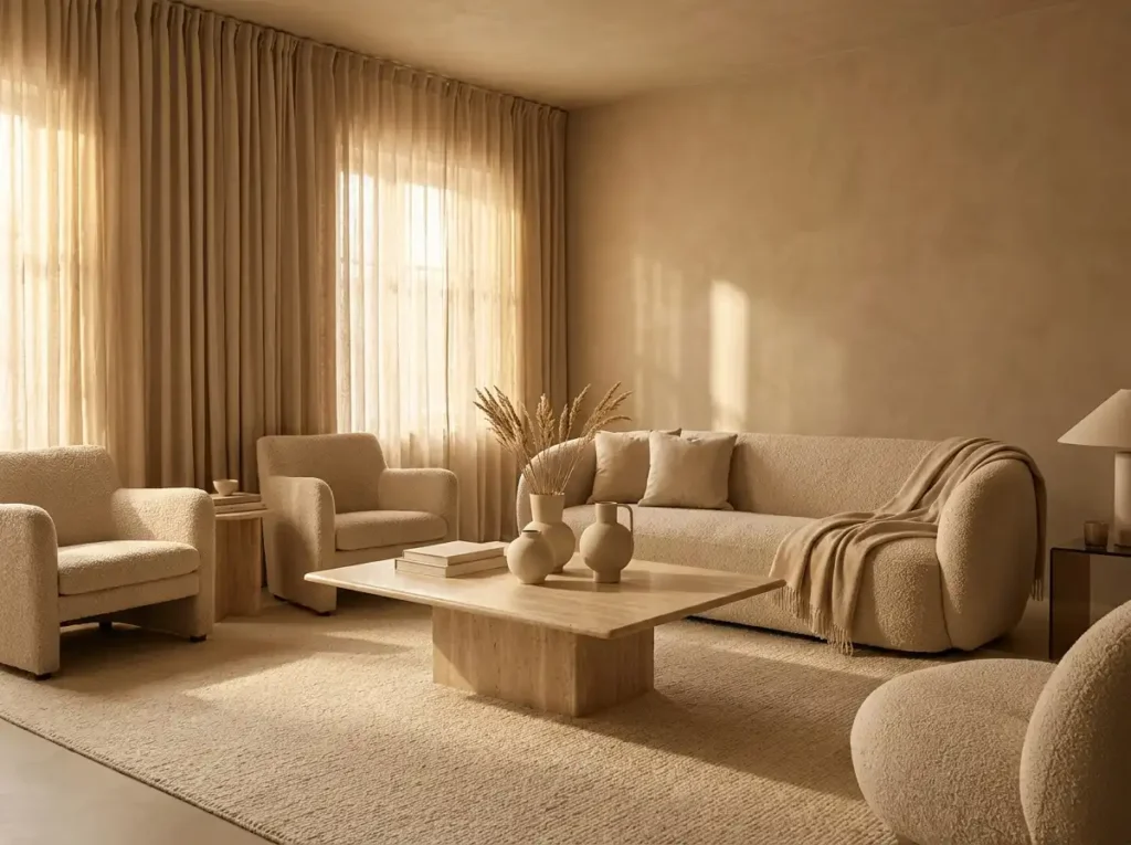
Color Drenching
Color drenching is one of the most talked-about paint trends on social media right now. The idea is simple. Instead of painting only the walls, the same color or a closely related color is used across the walls, trim, doors, built-ins, and sometimes the ceiling. The result is a room that feels more complete and intentional.
This trend is showing up heavily in TikTok and Pinterest home content because it creates an immediate before-and-after effect. A standard room can suddenly feel custom, designer-led, and more expensive. It also photographs well, which is one of the reasons it spreads so quickly online.
“Color drenching can be beautiful when it is done in the right room. Where I tell homeowners to be careful is using a dramatic color across too much of the house. A bold office or powder bath is one thing. A whole main level in a dark trending color is a much bigger commitment.”
Color Drenching Color Choices
- Deep green
- Navy blue
- Chocolate brown
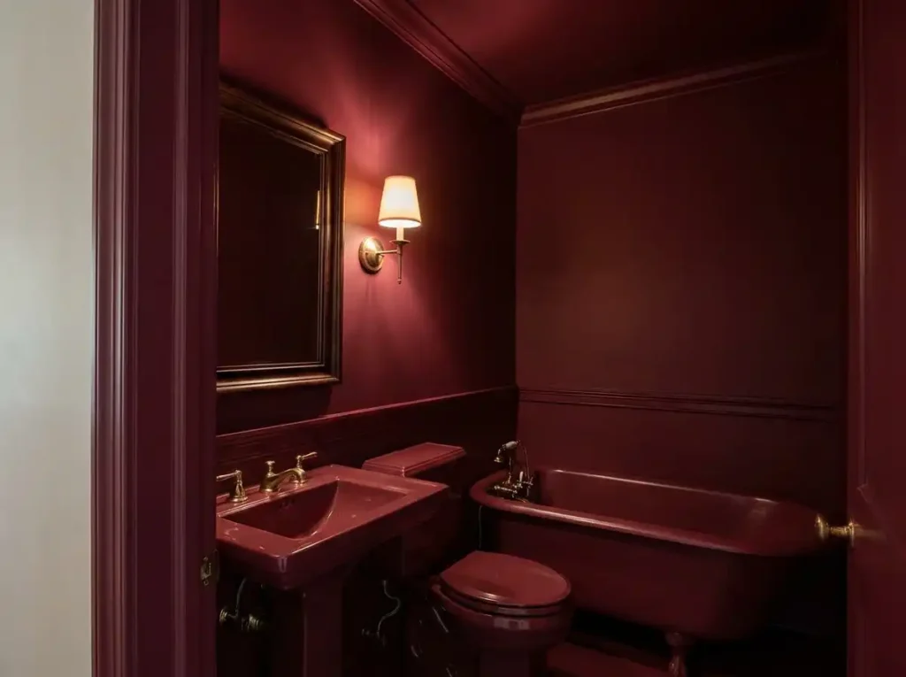
- Burgundy
- Terracotta
- Muted clay
- Soft mushroom
- Warm beige
- Dusty blue
How to Use Color Drenching
The key is choosing the right room. Color drenching can work beautifully in dining rooms, offices, powder bathrooms, bedrooms, libraries, and smaller spaces where a more dramatic feel makes sense. It can also help awkward rooms feel more cohesive because the trim, walls, and architectural details stop competing with each other.
That does not mean every room should be drenched in one color. In open-concept homes, especially many newer homes in Fort Collins, Windsor, Timnath, and Loveland, color drenching needs to be used carefully. If one room flows directly into another, a strong color choice can affect the entire main level.
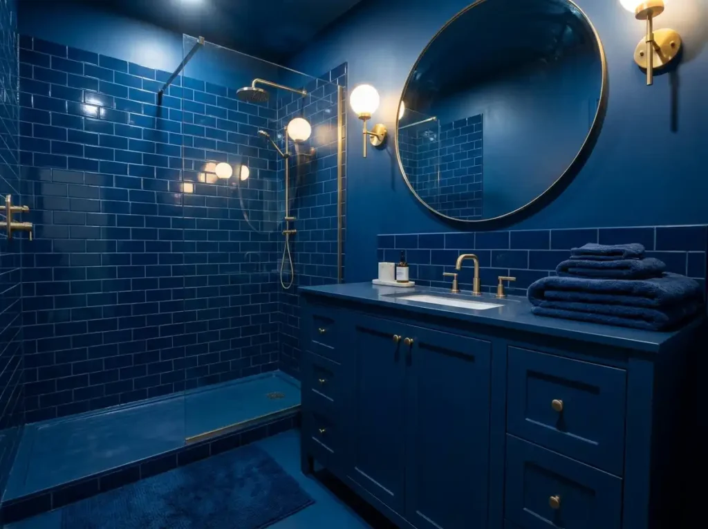
Our Take on Color Drenching
Color drenching can be a great choice when it is planned correctly. The biggest mistake is choosing a color from a phone screen and applying it everywhere without testing it in the space. Lighting, ceiling height, flooring, furniture, and trim details all matter.
This is exactly where a professional color consultation helps. For qualifying projects with MGM Painting Co., homeowners receive a 1-on-1 color consultation with professional designer, June. She can help determine whether color drenching makes sense for your home, which surfaces should be included, and what finish will give the room the best result.
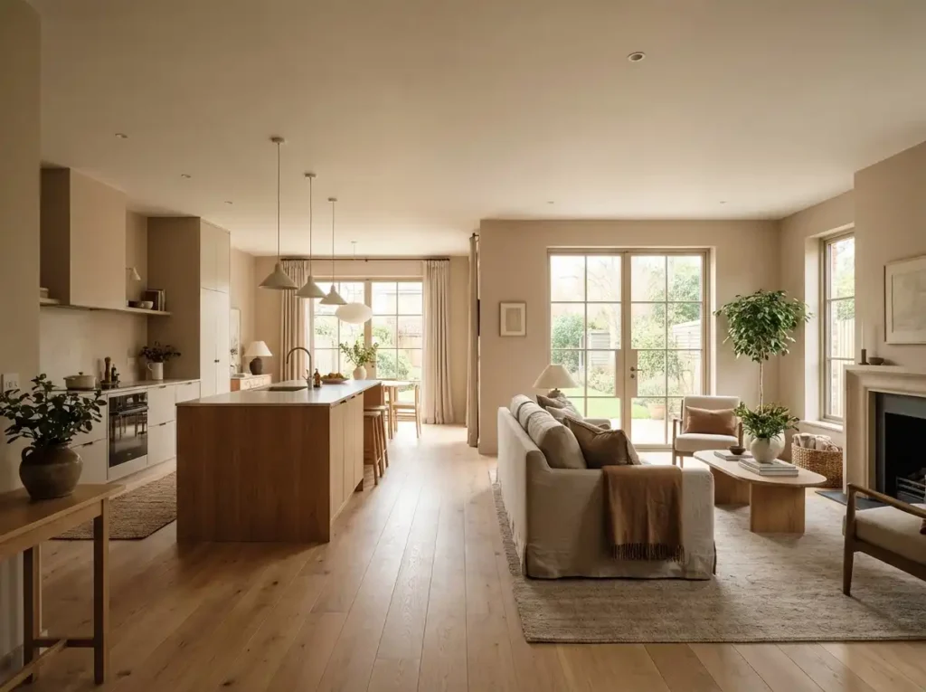
Warm Neutrals Are Replacing Cool Grays
One of the clearest trends across social media and paint brand color forecasts is the move away from cool gray.
Gray had a long run. It worked well with white trim, modern flooring, and simple staging palettes. But many homeowners are now feeling that cool gray can look flat, cold, or dated, especially in homes with warm wood, natural stone, cream tile, or soft lighting.
Warm neutrals are one trend I feel good about for a lot of homes. They are not as risky as some of the bold colors people see online, but the undertone still matters. A warm white can turn yellow. A beige can look muddy. That is why sampling is such an important step.”
Popular Warm Neutral Colors
- Warm white
- Soft cream
- Greige
- Mushroom
- Taupe
- Warm beige
- Oatmeal
- Soft clay
- Stone-inspired neutrals
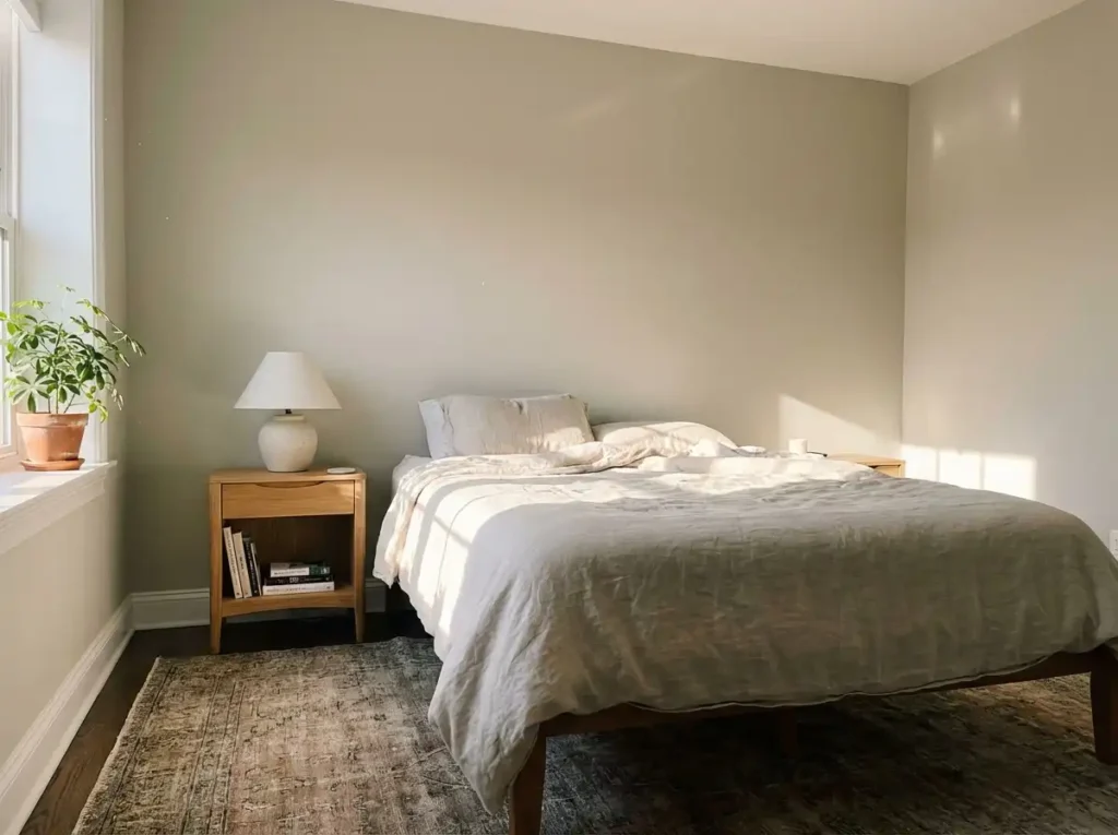
Why Choose Warm Neutrals
These colors still feel clean and flexible, but they add more comfort. They also pair better with natural materials, which is important as wood tones, stone, leather, and organic textures continue to trend in interior design.
For Northern Colorado homes, warm neutrals often make a lot of sense. Many homes in Colorado have warm wood flooring, natural light, mountain-inspired finishes, or exterior views that already lean earthy. A warmer neutral can make the home feel more connected and less sterile.
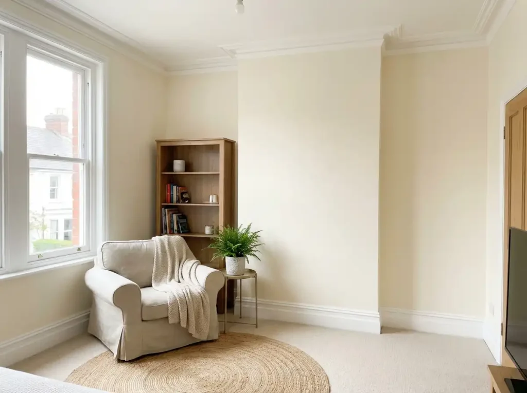
Our Take on Warm Neutrals
Warm neutrals are one of the safest viral trends for long-term value. They are easier to live with than bold colors, easier to decorate around, and better for resale than trend-heavy shades.
The important detail is undertone. Some warm whites turn yellow. Some greiges turn purple. Some taupes look muddy in low light. This is why professional sample review is important before painting an entire interior. Through our partnership with Guiry’s Color Source, MGM Painting helps owners connect with a professional designer to find the perfect warm neutral color for their home.
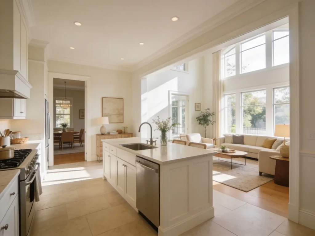
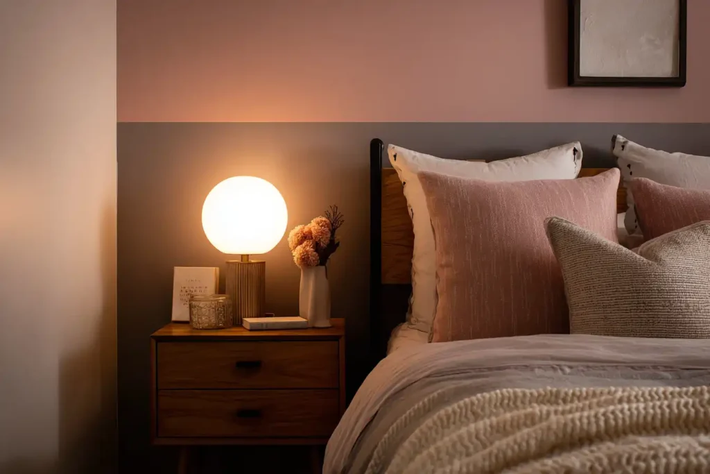
Moody Greens, Browns, Blues, and Reds
Pinterest’s recent color trend signals have leaned into bolder color families like cherry red, butter yellow, indigo, and dill green. Paint brands have also been pushing deeper, more grounded colors, including smoky greens, rich browns, earthy neutrals, and dark red tones.
This lines up with what homeowners are seeing online. Rooms with more depth are standing out more than plain white or light gray rooms.
“Dark, saturated colors can make a room look incredible, but they also show the quality of the prep work. If the walls are rough, if the sheen is wrong, or if the cut lines are sloppy, darker colors will show it. That is one of the places where a professional finish really matters.”
Popular Moody Color Choices
- Dill green
- Deep navy
- Indigo
- Dark teal
- Espresso brown
- Chocolate brown
- Burgundy
- Wine red
- Clay
- Terracotta
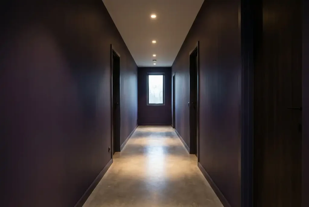
Why This Trend Works
These colors work because they feel bold without always feeling loud. A deep green office can feel calm and focused. A chocolate brown dining room can feel warm and elevated. A navy bedroom can feel restful. A terracotta accent can add warmth without looking trendy in the wrong way.
The reason these colors are doing well online is also practical. They create contrast. They give the camera something to react to. They make before-and-after videos more dramatic.
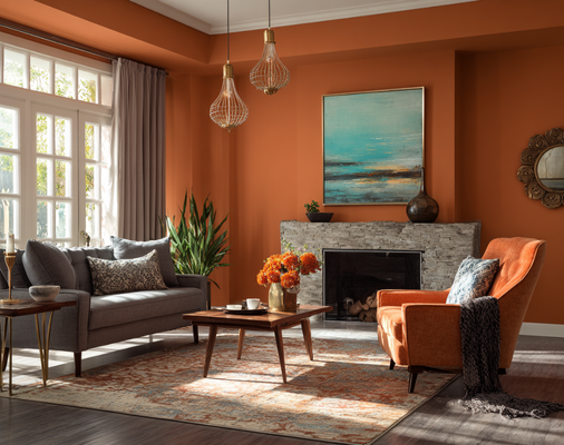
Our Professional Take on Moody Colors
Moody colors can look incredible, but they need clean prep and professional application. Dark colors show roller marks, poor cut lines, uneven sheen, and wall imperfections more easily than lighter colors.
This is one reason hiring a professional painter matters. A deep green wall might look simple in a 20-second reel, but the final result depends on prep, primer when needed, quality paint, proper coverage, and consistent finish.
If you want to try a bold color without repainting your entire home, consider using it in a powder room, office, bedroom, dining room, built-in area, or a smaller feature space.
Accent Walls Are Changing Significantly
Accent walls have been around for a long time, and lately there has been debate online about whether they are “in” or “out.”
The better answer is that accent walls are evolving.
The old version was often one random wall painted a dark color while the rest of the room stayed light gray or white. That can still work in some homes, but it often feels unfinished if it is not connected to the rest of the design.
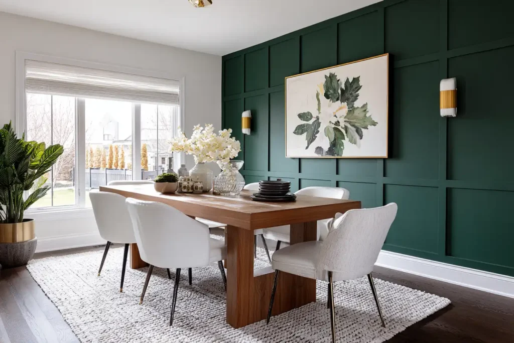
“An accent wall should have a reason. It should highlight something, like a fireplace, a bed wall, built-ins, or a dining area. When it is just one random wall painted dark because it looked good online, that is when it can start to feel dated.”
Modern accent wall ideas:
- Tone-on-tone painted walls
- Painted trim or picture-frame molding
- Built-ins painted in a contrasting color
- A ceiling painted as the accent
- Soft contrast instead of sharp contrast
- Dark color used in a defined architectural area
- Accent colors that tie into furniture, rugs, tile, or exterior views

Why this trend is popular
YouTube Shorts and Instagram continue to show strong interest in accent wall projects because they are easy to understand. They create quick transformations. They are also more affordable than repainting an entire interior.
For homeowners, this makes accent walls a useful option when the goal is to add personality without committing to a full color-drenched room.
Our Professional Take on Accent Walls
An accent wall should have a reason. It should highlight a fireplace, bed wall, built-in, dining area, ceiling detail, or architectural feature. If there is no natural focal point, the color can feel forced.
A good accent wall should also connect to something else in the room. That might be the cabinetry, tile, furniture, artwork, flooring, or exterior color palette.
Limewash and Plaster-Inspired Wall Finishes
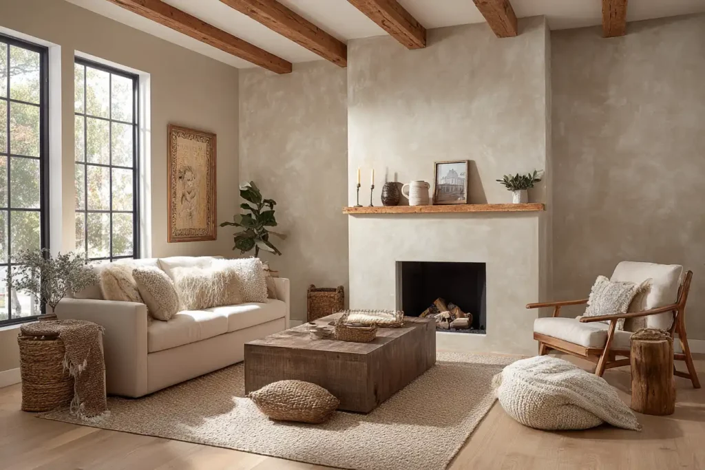
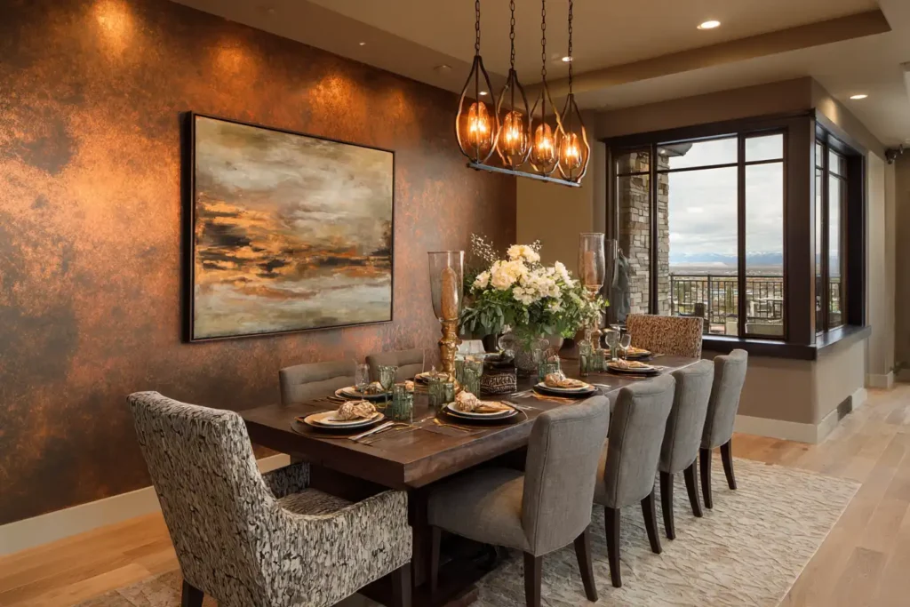
Lewiash, Roman clay, plaster-inspired finishes, mineral-style paint, and soft cloudy wall effects have become popular because they add movement and depth. Instead of a flat wall with one solid color, these finishes create a handmade look.
This trend performs well on social media because it is visual. Close-up videos show the movement of the brush, the texture of the product, and the way light changes across the surface. The finished wall often feels more custom than standard paint
“This is one of those trends where the video can make it look easier than it is. Textured finishes can be great, but homeowners should understand what they are getting into. The wall condition, product, technique, and future touch-ups all matter.”
Colors for this trend:
- Soft beige
- Warm white
- Clay
- Terracotta
- Sage
- Stone gray
- Muted green
- Cream
- Taupe
The look can be beautiful in bedrooms, living rooms, powder rooms, entryways, and dining areas. It works especially well in homes that already have organic materials like wood, stone, linen, leather, or handmade tile.
Our Professional Take on this painting texture trend
This is one of the trends where homeowners should be careful with DIY expectations. Many videos make textured finishes look quick and simple, but the final result depends on wall condition, product choice, technique, lighting, and experience.
A poor application can look blotchy instead of natural. It can also be difficult to repair or repaint later depending on the product used.
If you love the look but want something more practical, a matte or low-sheen paint in a warm earthy color can give you a softer, more elevated feel without fully committing to a specialty finish.
Painted Ceilings
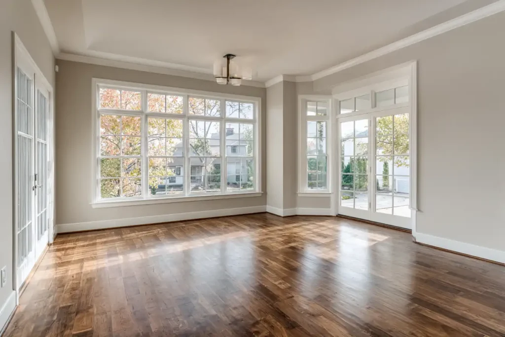
Ceilings are getting more attention as homeowners look for new ways to add character without changing the entire room.
For years, most ceilings were automatically painted flat white. That is still the right choice in many homes because it reflects light, keeps rooms feeling open, and provides a clean finish. However, social media design trends have made homeowners more open to treating the ceiling as part of the overall color palette.
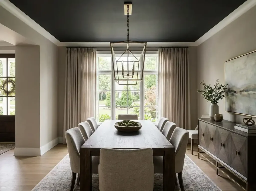
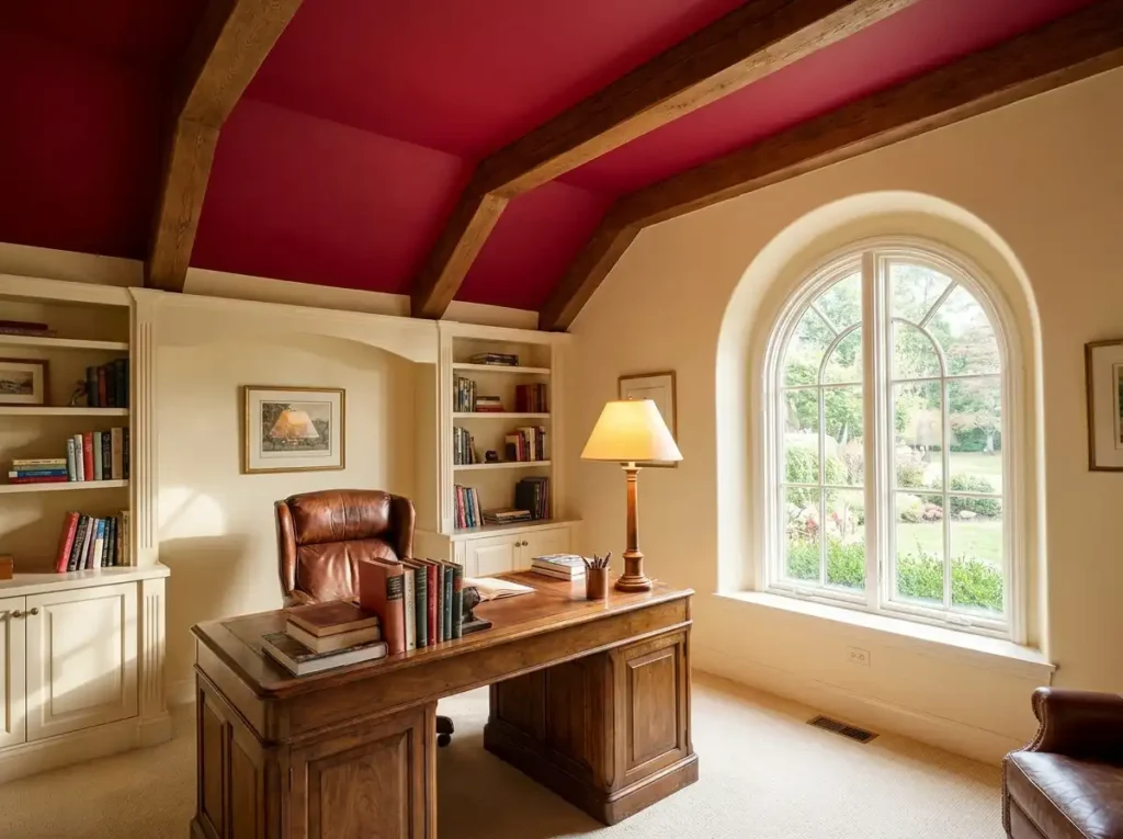
“Ceilings can change the whole feel of a room, but they need to be handled carefully. A dark ceiling in the right space can look high-end. In the wrong space, it can make the room feel lower, darker, or smaller than the homeowner expected.”
Why Paint a Ceiling?
- Make a dining room feel more finished
- Add depth to a bedroom
- Create a cozy office
- Bring drama to a powder room
- Make tall rooms feel more grounded
- Tie together a color-drenched space
How to use this trend
Popular ceiling colors include soft blue, warm beige, muted green, blush, charcoal, navy, and the same color used on the walls.
This trend also connects to the larger shift toward more intentional painting. Homeowners are no longer thinking of paint as just wall color. They are thinking about the full room, including trim, doors, ceilings, built-ins, and transitions.
Our Professional Take
Painted ceilings can look great, but they are not right for every room. Ceiling height, natural light, wall color, and flooring all matter. In a low-light room, a dark ceiling can make the room feel smaller. In the right space, it can make the room feel polished and custom.
If you are considering a painted ceiling, it is smart to test the color on a large sample and look at it during different times of day.
Short video. Fast Choices.
One of the biggest takeaways is that short-form video is shaping homeowner expectations.
TikTok, Instagram Reels, and YouTube Shorts reward fast transformations. The most effective painting content usually includes a strong before shot, quick prep clips, close-ups of the paint going on, and a final reveal. This format makes a project feel simple, quick, and satisfying.
That can be helpful for inspiration, but it can also create unrealistic expectations.
“A good paint job is not just the final coat. The prep work is what determines whether the result looks clean and lasts. Social media usually shows the reveal, but the sanding, caulking, patching, priming, and protection are what make the reveal possible.”
Watcher Beware
A 30-second video may not show:
- Wall repairs
- Sanding
- Caulking
- Primer
- Dry time
- Multiple coats
- Color sampling
- Protection of floors and
- furniture
- Trim detail
- Cleanup
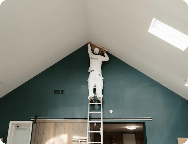
The finished look is only possible because of the steps that happen before the reveal.
Social Media Is Making Color Consultation More Valuable
With so many paint ideas online, homeowners are getting more inspiration than ever. They are also getting more overwhelmed.
A professional color consultation helps bridge the gap between online inspiration and real-life results.
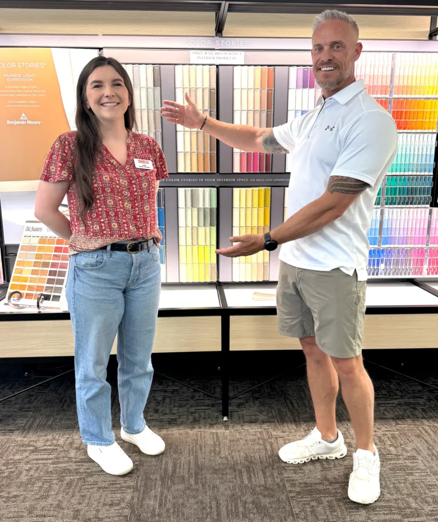
With MGM Painting Co., qualifying projects receive a free 1-on-1 meeting with Guiry Color Source’s professional designer, June. She helps homeowners choose colors that work with the home’s lighting, architecture, flooring, cabinetry, exterior materials, and overall style.
Learn more about our professional color consultation service.
Talk with a professional painting contractor
Viral paint trends can be a great starting point, but your home deserves more than a trend copied from a screen.
MGM Painting Co. helps homeowners and businesses choose colors, finishes, and painting solutions that fit the space, the lighting, the architecture, and the long-term goal of the project.
MGM Painting Co proudly serves Fort Collins, Loveland, Windsor, Timnath, Greeley, Wellington, and Johnstown with professional exterior painting services.
MGM Painting Co provides professional exterior painting services backed by quality craftsmanship, clear communication, a 5-star Google rating, and A+ accreditation with the Better Business Bureau (BBB). Contact us today to schedule your estimate and refresh your home’s exterior with confidence.


Frequently Asked Questions
Some are, and some are not.
Warm neutrals and grounded exterior palettes tend to support resale because they appeal to a wider range of buyers. Highly personalized or bold color choices may need to be repainted before selling.
You need to consider lighting, flooring, cabinetry, trim, ceiling height, and how rooms connect to each other.
A color that looks great online may look completely different in your space. Sampling and professional guidance can help avoid costly mistakes.
Not necessarily.
Color drenching works best in smaller or more defined spaces like offices, dining rooms, bedrooms, and powder rooms. In open-concept homes, it should be used more carefully so it does not overwhelm the entire space.