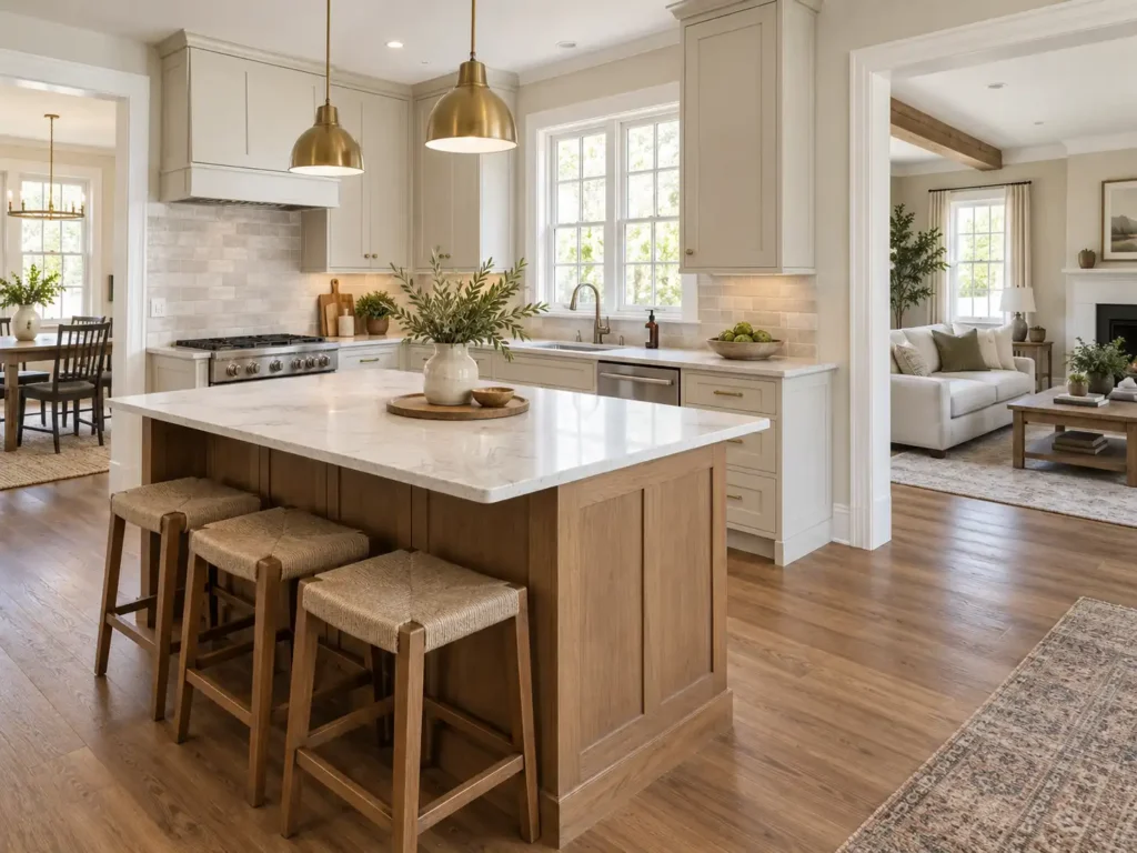
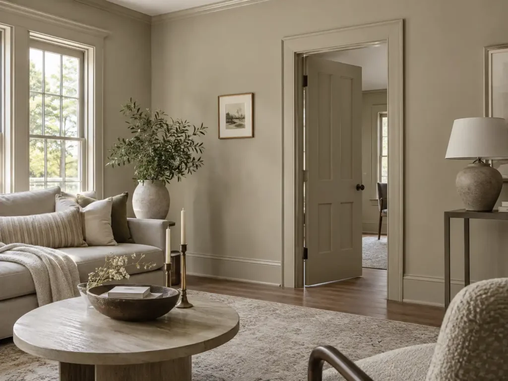
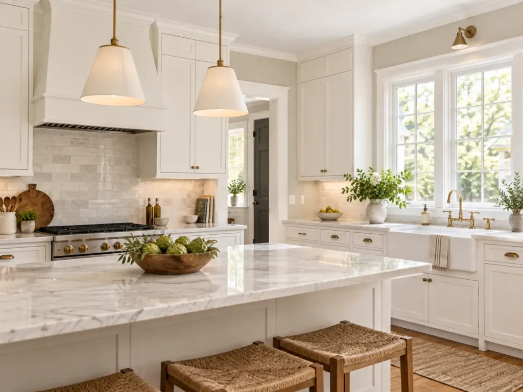
Choosing a wall color becomes more complicated when you place it next to your trim, kitchen cabinets, flooring, and countertops. A white that looked clean on a sample card may appear too bright beside cream cabinets. A gray wall color might bring out an unexpected pink tone in your backsplash.
These differences are why selecting paint colors individually can lead to disappointing results. Walls, trim, and cabinets need to work together with the materials and lighting already in your home.
At MGM Painting Co., we recommend looking at the complete room before choosing individual colors. Whether you are refreshing your walls, repainting kitchen cabinets, or planning a larger interior update, the following steps can help you create a coordinated look.
Qualifying MGM Painting Co. projects include a free professional color consultation through our partnership with Guiry’s Color Source. Our customers can meet one-on-one with a professional designer who can help compare deck stain colors and coordinate the finish with siding, trim, doors, and other exterior surfaces.
This can make choosing a deck stain much easier, especially when you are changing the existing color or want the deck to complement the rest of your home’s exterior.
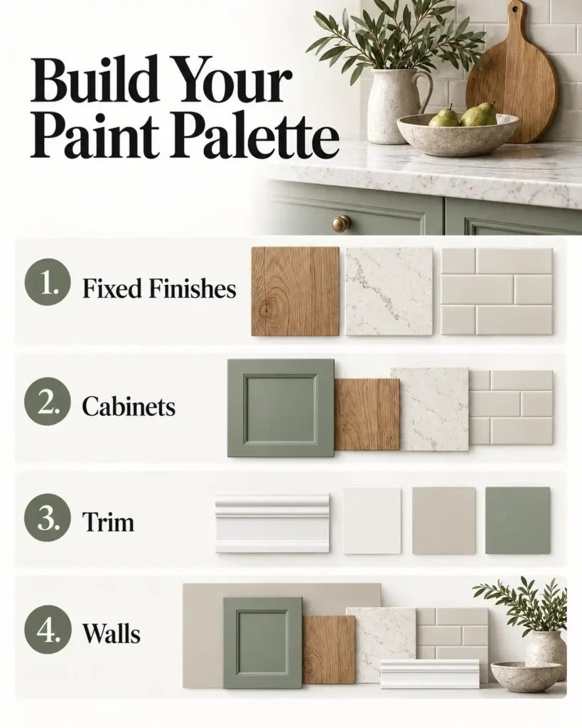
Before comparing paint samples, take inventory of the surfaces that will remain. Your flooring, countertops, backsplash, fireplace, and existing woodwork already contribute color to the room.
Questions you should to be able to answer:
Are the cabinets being painted, replaced, or left as they are?
Will the countertops and backsplash stay?
Is the existing trim color staying throughout the house?
What colors are present in the flooring?
Which adjoining rooms are visible from this space?
These answers establish the boundaries for your paint choices. If your kitchen has cream countertops and warm wood floors, those materials should influence your cabinet, wall, and trim selections. If your cabinets are staying white, their particular shade of white becomes an important reference point.
Choose paint around the finishes you plan to keep. This helps the finished room feel coordinated and can prevent a relatively simple painting project from creating pressure to replace other materials.
Understand How Undertones Affect Your Color Palette
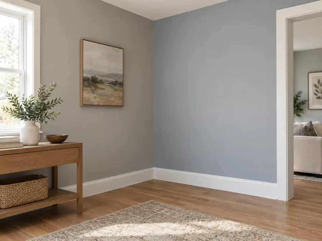
An undertone is the subtle color influence that makes one neutral look different from another. White paint can lean creamy, pink, blue, or green. Gray may appear warmer, cooler, or more violet depending on the color and its surroundings.
These differences become easier to see when colors are placed beside each other.
For example, a cool white trim sample beside warm cream cabinetry may make the cabinets look more yellow. A gray wall sample beside beige tile may reveal a violet cast that was difficult to notice at the paint store.
The goal is to find colors that look comfortable together in your room. Similar undertones can help create that relationship, particularly when you are working with several whites or light neutrals.
When comparing samples, look beyond whether you like each color individually. Ask whether the combination makes your cabinets, counters, and flooring look the way you want them to look.
Can You Mix Warm and Cool Colors?
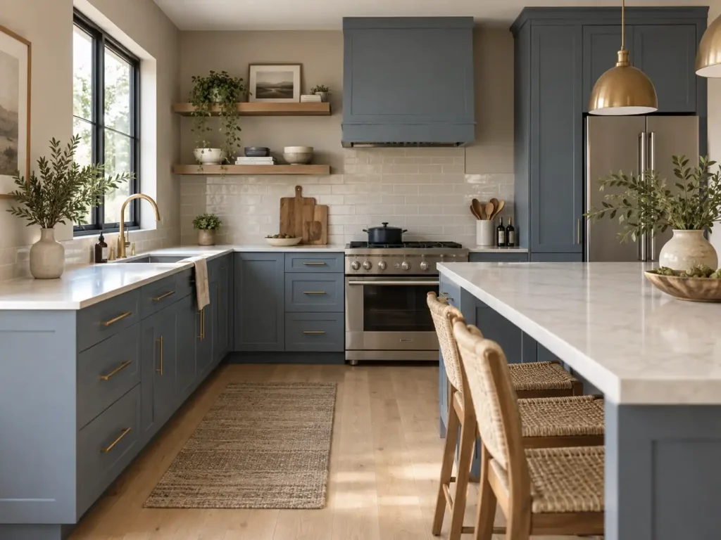
Yes. Warm wood floors can work beautifully with blue cabinets, and a warmer wall color can soften a room with cooler finishes.
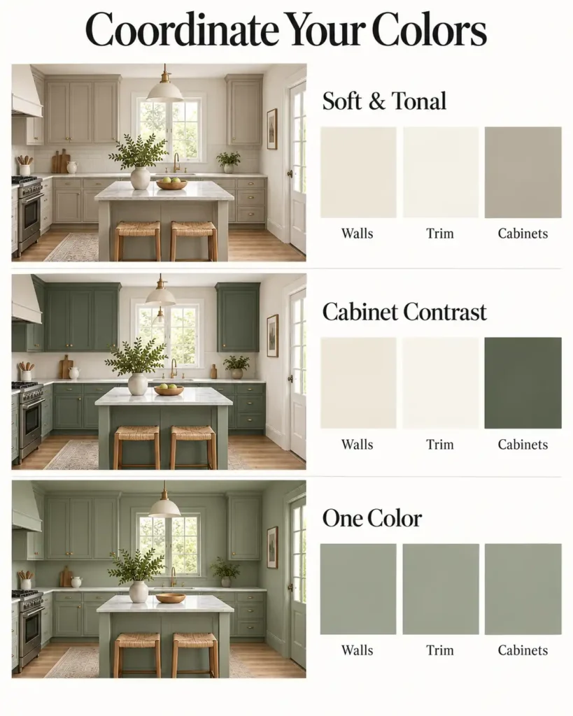
The key is choosing that contrast intentionally. Closely related neutrals often need careful undertone coordination, while a clearly different cabinet color can introduce contrast without looking like an attempted match.
You do not need to force every surface into the same color family. You do need to evaluate the complete combination.
Choose Your Cabinet Color with the Countertops and Backsplash
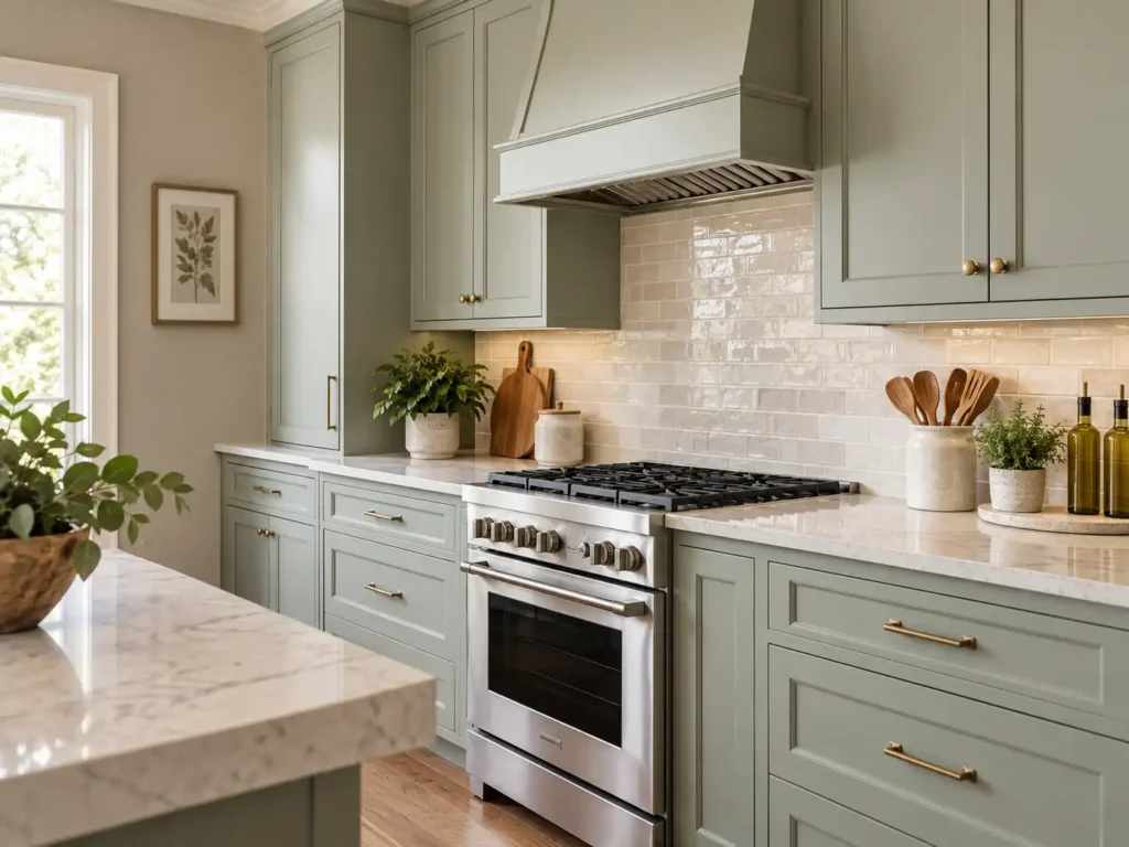
Cabinets occupy a substantial amount of visual space, particularly in kitchens with full-height cabinetry or large islands. Their color also sits directly beside the countertop and backsplash, making those relationships especially noticeable.
If you are repainting your cabinets, begin by comparing cabinet samples against both surfaces.
Look at the main background color of your countertop as well as its veining or pattern. A color that coordinates with one small fleck may still clash with the overall surface. View the combination from across the room as well as up close.
Confirm the cabinet direction before finalizing the wall color. This gives you a clear reference point for coordinating the rest of the room. For color inspiration, explore our guide to cabinet paint colors for Colorado homes.
For a busy countertop or backsplash, a quieter cabinet color can give the eye a place to rest. If the surrounding materials are understated, you may have more flexibility to use a deeper or more colorful cabinet finish.
Should the Island Be a Different Color?
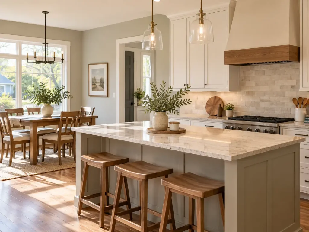
A contrasting island can create a focal point without introducing color to every cabinet.
Keep the island connected to the room through another element, such as the countertop, furnishings, or a color used in an adjoining space. Review the island sample with the perimeter cabinet color rather than approving them separately.
If the kitchen already includes several competing patterns and finishes, one cabinet color may provide a calmer overall appearance.
Decide Whether Your Trim Should Blend In or Stand Out
Trim frames windows, doorways, and the transitions between walls and floors. Its color can emphasize those details or help them recede into the room. White trim is a familiar option, but it is only one approach.
Lighter Trim with Colored Walls
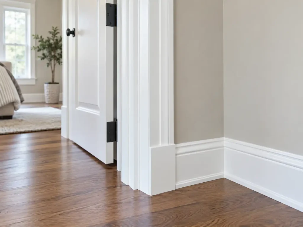
Lighter trim creates definition around architectural features. This approach works well when you want door casings, baseboards, and crown molding to remain visible against the wall color.
The white still needs to coordinate with the room. Compare it with nearby cabinets, tile, and any existing painted surfaces. Our guide to trim and ceiling white paint colors provides additional options to consider.
Darker or Colored Trim
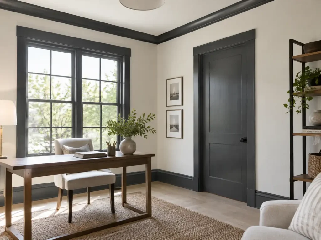
Darker trim can highlight the shape of a doorway or the proportions of a room. It can also connect painted woodwork with deeper cabinet colors or other features.
Before committing, consider how that trim will transition into adjoining rooms. A strong trim color should feel deliberate wherever it is visible.
Matching Walls and Trim
Using the same color on walls and trim creates a more continuous appearance. This can be useful when you want fewer visual breaks or prefer a quieter background for furniture and artwork.
Different sheens can provide subtle separation. For example, an eggshell wall finish and satin trim finish may distinguish the surfaces while keeping the color consistent.
Should White Cabinets and White Trim Match?
White cabinets and white trim can match, but they do not have to.
If both are being repainted, using the same selected white is one way to simplify the palette. It reduces the number of closely related colors you need to coordinate.
If your cabinets are staying, use their existing finish as the starting point. Place proposed trim samples directly beside a cabinet door and compare them with the countertop and backsplash.
Two whites that look nearly identical on separate sample cards may appear noticeably different once they are side by side. One might look creamier, grayer, or brighter than expected.
Different whites can work when the relationship looks intentional. The decision should come from viewing them together in the room.
Remember that matching paint colors may appear different across surfaces. Cabinet doors and trim receive light from different angles, and differences in sheen can affect their appearance.
Select a Wall Color That Supports the Whole Room
Once you have established the cabinet and trim direction, evaluate wall colors alongside them.
The walls can provide a quiet background, introduce warmth, or add another layer of color. Think about which part of the room you want to receive the most attention.
If you have deep green cabinets and a strongly patterned countertop, a restrained wall color may help balance the space. If your cabinets, counters, and trim are all subtle neutrals, the walls can carry more color.
Avoid choosing a wall color solely because it matches one accessory. Rugs, curtains, and artwork can help connect a palette, but your wall color should also work with the larger surfaces that are staying.
A useful test is to view the samples without decorative items nearby. Does the relationship between the walls, cabinets, trim, and flooring still feel complete?
Work with the Color in Wood Cabinets and Floors
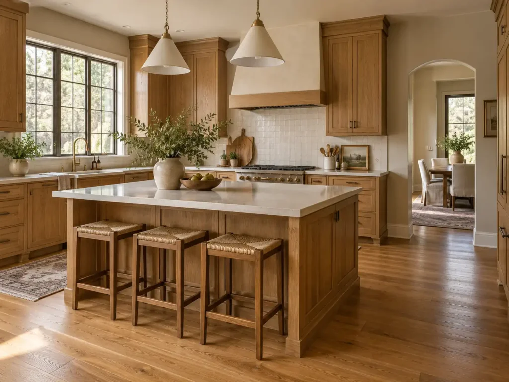
Natural wood brings its own color into the room. Oak may show golden or orange tones, while other wood finishes can appear reddish, dark brown, or muted.
Decide whether you want to emphasize that warmth or create a softer relationship around it.
For a quieter palette, begin with restrained colors that relate to the wood and surrounding materials. For more contrast, explore colors that make the wood stand out.
Be careful with advice that a particular paint color will “cancel out” the orange or red in wood. Contrasting colors can make those tones more noticeable. Blue beside orange-toned wood, for example, may emphasize the warmth rather than disguise it.
Test your samples against the actual wood finish. The wood species alone does not tell you how the stain, clear finish, and lighting will affect its appearance.
Check the Colors in Your Home’s Lighting
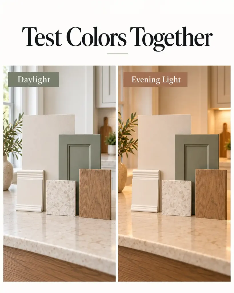
Daylight changes throughout the day, and artificial lighting introduces another set of conditions. A kitchen that looks balanced in afternoon light may feel quite different under its evening lighting.
In Northern Colorado homes, window direction is a useful starting point. North-facing rooms often receive more subdued daylight, while south-facing spaces commonly receive stronger sun. Nearby buildings, trees, roof overhangs, and window coverings also influence the light entering the room.
If you plan to change light bulbs or fixtures, make those decisions before approving the paint palette. Evaluate the colors under the lighting you intend to keep.
Color and sheen should be considered together. Sheen affects how much light a painted surface reflects, which can change its appearance.
Walls, trim, and cabinets also have different performance needs. Cabinet doors receive frequent handling and cleaning, while a bedroom wall may experience much less wear.
Surface
Common Finish Options
What to Consider
Interior walls
Matte or eggshell
Desired appearance, wall condition, and washability
Trim and doors
Satin or semi-gloss
Cleaning needs and how much definition you want
Kitchen cabinets
Satin or semi-gloss
Suitable cabinet coating and preferred level of reflection
Ceilings
Flat
Reduced glare and less emphasis on surface imperfections
These are starting points. The best choice depends on the specific paint product, surface, and desired result.
Higher sheen can make surface imperfections more noticeable. Durability also depends on the coating itself, so sheen should not be the only factor used to choose a cabinet or trim paint.
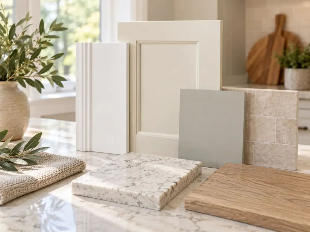
Small paint chips are helpful for narrowing your options. Larger samples make it easier to evaluate the final combination.
Instead of covering a wall with unrelated colors, narrow your choices to two or three coordinated palettes. Each should include the proposed wall, trim, and cabinet colors.
Prepare separate samples. Use large sample boards or suitable peel-and-stick samples.
Label each color. Keep the brand, color name, and color number with the sample.
Place the samples together. Compare them beside your countertop, backsplash, flooring, and existing finishes.
View them in position. Hold wall and cabinet samples upright where those colors will appear.
Check multiple lighting conditions. Review the palette during the day and evening.
Confirm the final finish. When needed, review a dried sample in the intended product and sheen.
Sample paint may have a different finish from the coating used on your cabinets or trim. It is useful for evaluating color, but it may not fully represent the final surface.
In an open floor plan, the kitchen palette becomes part of the living room and dining area. Stand in those adjoining spaces and look back toward the cabinets and trim before making a final decision.
Repeating a trim color can help connect rooms. Related wall colors and selected accent colors can also create continuity without making every space identical.
If you are painting in stages, establish the broader palette first. You can complete one room at a time while knowing how later updates will fit together.
This is especially helpful when a kitchen cabinet project will eventually be followed by interior wall or trim painting.
Professional Interior and Cabinet Painting in Northern Colorado
A coordinated paint palette should complement your home’s materials, look right in its lighting, and reflect your personal style. MGM Painting Co. proudly serves Fort Collins, Loveland, Windsor, Timnath, Greeley, Wellington, and Johnstown with professional interior, trim, and cabinet painting services.
Qualifying MGM Painting Co. projects include a free professional color consultation through our partnership with Guiry’s Color Source. You can meet one-on-one with a professional designer for help coordinating walls, trim, and cabinets with your flooring, countertops, and other finishes.
Whether you are refreshing a single room or planning a larger update, our team brings detailed preparation, quality craftsmanship, and clear communication to every project.
Either approach can work. Lighter walls can provide contrast around deeper cabinets, while darker walls can give light cabinetry more definition. Similar color depths create a softer transition. Choose the relationship based on your lighting, fixed finishes, and preferred focal point.
Yes. Using one color across several surfaces can create a cohesive appearance. Differences in sheen, texture, and lighting will still give the surfaces some visual variation. Each surface should receive a coating appropriate for its use.
No. White walls can work with white, colored, darker, or natural wood trim. If you choose two different whites, compare them together so the difference looks intentional.
Yes, provided the new cabinet color works with the existing wall and trim colors. Include those existing finishes when testing cabinet samples. You may find that the current palette already supports the update.
Evaluate them together and look for paint colors that create the most comfortable overall relationship. A quieter palette may help when several existing materials compete for attention. This is also a useful situation for a professional color consultation.